Archive for release

State of the Hunt, Week 26/2019: First Contrast Paint impressions

Posted in paintjob, state of the hunt with tags , , , , , , , , , , , on June 24, 2019 by krautscientist

Something of an interlude for today, since I got the unplanned opportunity last week to get some hands-on experience with the new Contrast Paints and would like to share a couple of observations, as well as some photos of my two test models.

Be advised, however, that this post won’t be an in-depth review — if you are that way inclined, let me point you towards this excellent article over at Tale of Painters for an actual, thorough all-corners review. This is basically just me fooling around with a new toy 😉

I was, of course, interested Already seeing some intriguing stuff online and getting some encouraging pointers from fellow hobbyist-recently-turned-TeeVee-superstar Jeff Vader. So when the opportunity to test the paints arose at the local Warhammer store (now again crewed by a very decent store manager, I must add), I got straight to work.


Anyway, all the Space Marines were already taken, so I ended up with a female Stormcast Sequitor (one of my favourite easy to build models, though, so all was well) and a Poxwalker. Both of the models were already glued together and undercoated when I started working on them. Here’s what I came up with during my time in the store:

The Sequitor took me about 45 – 60 minutes of fairly neat painting (and of getting to grips with the new paints in the first place). Quite a bit of the time was also spent trying to wedge my brush into all the nooks and crannies behind the shield, as the model had already been glued together beforehand.

The Poxwalker, by contrast, was a crazy and fun 15-minute-romp of just letting rip with some of the pinks, purples and yellows.

Before we jump into the fray, let me just say up front that the freeflow, (water-)painterly way of painting these models was quite a wonderful change of pace! As was the freedom of simply painting something for the heck of it, with absolutely no danger of messing up whatsoever. So if nothing else, you should maybe give those paints a go at your local store, if only for the process to act as a wonderful little palate cleanser.

Anyway, let’s take a closer look at the two models and my experiences when painting them:

The Sequitor came undercoated with Grey Seer, the slightly greyer, colder undercoat from the recent release. I decided to go with a the main approach of black armour, red robes, as seen in N1SB’s Contrast Paint experiments here, because I really liked the look of the combination (plus it’s also a pretty fair approximation of a classic Sisters of Battle painting scheme, which was an added bonus).


Only a single coat of paint was applied on all parts of the model (except for the base, where I got a little more adventurous — more on that in a second). This should tell you how the new Contrast Paints really allow you to cover a lot of ground in a very short amount of time. In hindsight, I think I should have been a little more generous with the black, as the shading effect didn’t turn out quite as prominent as I would have liked. Even so, the Black Templar Black (for the armour) and Flesh Tearer Red (for the robes) were definitely the standout paints here, although the Fyreslayer Flesh skin tone came in at a close second (it’s really uncanny how the Contrast flesh tones actually allow you to paint a finished face in one painting step).

As for my initial observations:

  • I didn’t encounter any cases of splotchiness with the new paints, although I have to say the Sequitor was basically the perfect model to use these on, given the amount of surface texture, folds in the fabric etc. Everything dried fairly quickly and to a nice, matte finish.
  • not using metallic paints on the areas that are supposed to be metal was a very weird feeling, and I felt the need to break out the silver and gold on the Sequitor, in particular when it came to painting the weapon and shield.
  • Due to the fact that, as you have probably already heard elsewhere, Contrast Paints basically work like a heavy wash or a wood stain, you don’t simply get to paint over mistakes you have made, but may have to correct them by painting over any stray marks with Grey Seer or Wraithbone from the pot. Even though I only went back to correct one or two mistakes, I found this to be the least entertaining part of the whole exercise, especially since going back to the somewhat chalky undercoats after working with the free flowing Contrast Paints was such a stark, erm, contrast.
  • As I was warned by the store manager – and as I have discovered myself – models painted with Contrast Paints really, really need to be varnished, as it’s quite easy for the paint to get rubbed off. This happened to me once or twice during the painting process, although only on very small, sharp areas (such as the sharpest folds in the Sequitor’s robes).

So after spending about an hour neatly painting the Stormcast Sequitor, I simply wanted to have some quick fun and experiment a bit, and the Poxwalker model seemed like the perfect piece for that. Like I said, the painting process was just a wild 15 minute ride. The Poxwalker was undercoated with “Wraithbone”, the warmer of the two new undercoats, and it makes for a wonderfully vibrant overall look on the finished model. The “Darkoath Flesh” skin tone basically did about 70% of the work, and afterwards it was mainly a matter of painting on some pinks and purples while the skin tone was still wet:


If it’s Nurglite grossness you are going after, the Contrast Paints are just perfect, making for a very organic look. The augmetic arm was basecoated with Gryph Hound Orange, and then I slathered on one of the darker browns.

I think it would be really easy to knock out a rather massive hore of Poxwalkers in an afternoon with a recipe like this, which seems like a very interesting proposition.


But wait, I didn’t stop there, but rather took the models along to my painting session with my good friend Annie. I wanted to try and combine the base work done with the contrast paints with some of my usual techniques. So here are the models, once again, when I packed up at the Warhammer store:


And here’s how they look now:


For the Sequitor, I resisted to urge to break out the metal paints after all, and decided to keep her entirely “NMM”, for lack of a better word. I merely added some highlights here and there, especially where the red hadn’t “auto-shaded” quite as much as I had hoped:


Just to illustrate how easy it is to cover lots of ground with the new paints, however: The act of adding some highlights and finishing the paintjob took just as long, if not longer, than the entire stage of painting her with Contrast Paints (and getting her basically game-ready) beforehand!

One thing I only got to experiment with a bit was to use various browns and greens for a more natural, mossy look for the base. I only really tried a bit of this, but I think the use of Contrast Paints for painting really interesting looking bases definitely warrants some further experimentation!


The finished base was given a light drybrush of Screaming Skull and (of course) a tidied up black base rim 😉

In hindsight, I am not 100% sold on the look of the Iyanden Yellow: When it works, it really works, but it ended up looking slightly anaemic in several spots. But Nazdreg Yellow, seen here on a model painted by Annie, seems to be an interesting, slightly more golden-brownish alternative:

As for the Poxwalker, I ended up being a bit more adventurous, in an attempt to bring him closer to the rest of my collection. So I added just a dash of metallic paint, some thinned-down Blood for the Blood God, and repainted some small areas where the Contrast Paints looked a bit too water-colour-y to me, such as the boils, the loincloth and the leather belt and  pouches:


This guy could actually join the rest of my Nurglite models without a hitch — if anything, he only looks a bit more vibrant and infectious than my other models. Here’s a comparison picture with my “classic” Poxwalker scheme:


So yeah, this was a lot of fun! I really enjoyed the freeform, exploratory spirit of the whole session!

One thing that cannot be stressed enough – and this is relevant for my future treatment of Contrast Paints as a possible tool – is that the usefulness of the new paints really hinges on the colour of the undercoat: These really work best (or at all) when used over a very light undercoat. So if, like me, you favour black, grey or brown, you’ll find it harder to include them into your standard recipes. At the same time, it cannot be overstated how novel and original playing around with them feels, so they may just warrant a slight reshuffling of recipes and approaches. While I don’t think I’ll be abandoning “classic” paints (or dark undercoats, for that matter), the Contrast Paints are a ton of fun to play around with, and certainly a very promising new tool for painters. There are also armies that I think will be a blast to paint with these (I am looking at you, Tyranids, Eldar and Poxwalker hordes).

Two final observations before I wrap this up:

One, when seen at gaming distance, models that have been painted with nothing but Contrast Paints look completely painted — and pretty well painted, at that. If you look at them up close, especially when it’s an entire squad, Blood Bowl team or what have you, the paintjob still looks good, but maybe a bit basic. So an extra bit of highlighting here and there is where the models really go from good to great — you should keep this in mind!

Two, and this seems a slighly weird observation: If I didn’t know any better, I would say the new paints where designed to photograph well. Case in point, the picture towards the start of this post, after I had finished applying the Contrast Paints (but nothing else) actually make the models look just a wee bit cooler than they actually looked in real life at that point. Which, again, goes to show that you should probably still plan for an extra round of highlights and final tweaks.


Anyway, that’s all I can offer for now. I can safely say that this experience has been a blast, and that it’ll be very interesting to test the new paints further. And maybe, just maybe, you’ll find it helpful to get some firsthand observations from somebody who definitely isn’t a Golden Demon painter 😉 In any case, I would, of course, love to hear your thoughts — or learn what you think of the new paints!

As always, thanks for looking and stay tuned for more!

Coming full circle?! A closer look at Kill Team: Rogue Trader

Posted in 40k, Conversions, Inq28, Inquisitor, Pointless ramblings with tags , , , , , , , , , , , , , , , , on September 17, 2018 by krautscientist

As some of my readers have already pointed out, I no longer do many reviews these days. But I will gladly make an exception for Kill Team: Rogue Trader, one of the most delightful hobby surprises to come out of 2018 so far:

Kill Team: Rogue Trader is remarkable in several ways: For one, it’s a look at a part of the 40k universe that has appeared in background lore every now and then, but – apart from some Inquisitor models – has never been explored in depth in model form. There’s also the fact that this actually feels like an attempt to take the – already fairly promising – killteam concept into a more narrative and, dare I say it, inquisitorial direction. And at the same time, it also feels like coming full circle, in that both the subject matter and scope of the boxed set seems like a modernised look at the old Rogue Trader, as in: the first version of Warhammer 40k.


Enough reasons, then, to give this release a closer look. And it goes without saying that I will be focusing on the models that come with the set, looking at their strengths and shortcomings as well as thinking about possible uses for them in the wider hobby and the odd conversion opportunity. So here we go. Just like old times, eh? 😉

I. The Elucidian Starstriders

To get this right out of the way, I am simply in love with this kill team: GW’s sculptors have done an amazing job at making the team look like the actual household of a Rogue Trader, with an actual background story and some really interesting characters. That alone makes this part of the release a triumph!

I also really appreciate how not only are there strong shared design elements between the models (the baroque armour, the stylised heraldic animal crests for different ranks and functions), but the design also manages to both fit the 40k universe and expand its visual language (with a decidedly baroque influence versus the classic “gothic” approach), making it clear that Rogue Traders are a force unto themselves.


Rogue Trader Elucia Vhane

So, let us start with the actual Rogue Trader, Elucia Vhane: For the most part, this is a lovely and eclectic figure befitting the status of a Rogue Trader. Moreover, since most of the depictions of Rogue Traders so far have invariably shown dudes in some kind of 19th century-ish military uniform, I think we’ll have to give GW some extra kudos for going with a female Rogue Trader!

The detail on the model is rather lovely: The filigreed armour and ruffles are a great touch, as is the slightly old timey aquila clasp on her right shoulder.

My one gripe with the model is how her face is mostly covered by a veil: I get how this was probably supposed to show the eclecticism of Rogue Traders and also add an air of mystery, because you cannot help but wonder how Elucia looks under the veil: a woman kept young and beautiful by rejuvenat treatments? A hideous crone? Something altogether more mysterious? I can also really imagine the veil working great in one of John Blanche’s concept sketches.

The thing is, however, that it fares less well in actual model form. As it stands, the part of the model that should be its absolute focus point ends up looking, well, rather uninteresting. And given the fact that GW’s catalogue absolutely lacks interesting and characterful female faces, this choice seems like an even more egregious copout. Personally speaking, I think a half-veiled face, some kind of stylised porcelain mask (or, even better yet, half-mask) would have been a better solution here, and obviously made for an even more interesting character — therefore, the face is definitely the one thing I would personally convert.


Knosso Prond

Elucia Vhane’s personal assass…erm “bodyguard” has to be one of my top three models from this release: You can never go wrong with a poised, stylised pose with a sword, and Knosso illustrates this very well. I also love how there’s such a clear asian influence to her design – particularly evident on her sword and facemask – but it’s an influence that gets reflected through the general 40k look and feel, and the result is really lovely, if you ask me. That mask and hairdo, in particular, are just great touches! One of the high points, certainly!


Sanistasia Minst

Yet another female character (which is great), and also an exploration of a character archetype we haven’t seen all that often: the medic. The model does an awesome job of straddling the line between a clean, clinical look very fitting for a medicae, and the more ostentatious and baroque elements that are a part of the household’s visual language. I especially like how her equipment (the helmet, shoulder pad and gloves, in particular) seem functional and ostentatious at the same time.

Oh, and that Nurgling is a nice touch, obviously, creating a cool little shout out, both to the background of the game and to the Gellerpox Infected.


Larsen van der Grauss

The Starstriders’ resident tech-priest, Larsen has a very cool and weird design with a strong silhouette. There’s enough weird equipment and tech-y elements to keep us guessing how everything works. I especially like the head!
Funnily enough, the model doesn’t even look all that AdMech at first glance, but it’s cool to see the Tech-Priest look extended a bit, particularly for a member of the Adeptus Mechanicus who has been embedded with a different faction for a longer time.

The look and angle of the left arm seem like a shout out to the old 2nd edition characters that were fairly flat and needed to be all about silhouette — slightly anachronistic in these more modern times, but it actually seems like a conscious choice here, given the many shout outs to older lore and concepts.


Elucia also comes with her own household guard, which I think deserves extra compliments because these are a part of any given warband or retinue we normally don’t get to see — the actual soldiers doing the dirty work 😉

Stromian Grell

A burly man with a massive gatling gun — what’s not to like, right? Very iconic pose. Almost reminds me of one of the old Warzone Imperial (or Capitol) models, although in a good way. The boat cap is a lovely touch. I also love how his almost modern SciFi look gets tampered by the baroque influences, such as the filigree on the armour (and even on the weapon). The scarred forearms are also a cool little touch and a nice bit of visual storytelling that hints at an eventful life.

Also, kudos for actually going with a non-caucasian skin colour, ‘Eavy Metal Team! 🙂

Voidmaster Nitsch

Another very 2nd edition pose — and frankly, it’s amost a bit too much with the two guns. At the same time, I really love the clean lines of the model. And possibly my favourite part is how Nitsch foregoes the usual “pants in boots” look for some actual suit pants and a far more suave setup — very interesting, and also a rather interesting resource for converting INQ28 characters and Imperial civilians…

He also looks like an officer, a gentleman, but also a hard-as-nails veteran.

Nitsch’s Squad

Nitsch’s small squad ofs Voidsmen is actually one of my favourite parts of this release. Even though they are fairly uniform, the different poses and weapons (as well as the fact that their actual uniforms are really cool) still make them a great visual addition to the kill team. Even better, there’s yet another female character in there, and for once she doesn’t suffer from the endemic boob armour problem (and is arguably the coolest of the bunch). These three really bring the household vibe to life!

Plus the squad also features what must be the boxed set’s best model bar none: Aximillion the cyber-mutt:


Seriously, I just love this guy! The attentive pose and armour plates matching his handlers are just so cool. How I would have loved to have access to this model, back when I wanted to build a cyber-mastiff for my INQ28 collection! Granted, I found a different solution. But it’s still awesome to have an “official” GW model to fill the function!


II. The Gellerpox Infected

On the other side of the aisle, we get one of the weirdest and eclectic collections of mutants, monsters and creepy-crawlies I have ever seen in a GW boxed set. The Gellerpox Infected don’t seem so much like an actual killteam, but rather like a “toolkit” for a GM to populate a setting with monsters and opponents for the party to fight. Like the collections of monsters you would see in, say HeroQuest or Space Crusade.

So let us take a look at all of those creatures in turn:

Vulgrar Thrice-Cursed

The leader of the Gellerpox Infected, Vulgrar is huge and brilliantly detailed — the latter really was to be expected, given GW’s standard for plastic models these days. The model is a rather disturbing amalgamation of distressed flesh and crude bionics. While the Nurglite touches are subtle, I still like them: The three heads,  the pockmarked skin – they hint at the source of the Gellerpox plague without turning the model overwhelmingly Nurglite, which is pretty cool.

Those heads are particularly excellent and seem like they would just look fantastic on a wide variety of conversions. At the same time, the burning furnace, complete with flames licking out if it…may be a bit much 😉

In spite of many very cool design elements, I am still not in love with the model. I cannot quite put my finger on what’s the problem here, but it still feels like all the really cool individual components come together into a model that is somehow less than the sum of its parts. Is Vulgrar a terrifically detailed monstrosity? Without a doubt. But he’s not a showstopper or standout piece in a boxed set, like, say, the Dark Vengeance Helbrute used to be. My two cents 😉


Nightmare Hulks

Now these big guys obviously add a lot of visual oomph to the Gellerpox Infected. And I really love how they were designed with archetypal nightmare monsters in mind: the monster from the deep, the cannibalistic abomination, the relentless engine of destruction — I think we can all agree that these are some brilliantly disgusting abominations 😉


Gnasher-Screamer


Now this guy actually looks like a John Blance sketch come to life, which I think was the whole point. Giant Butcher-like brutes are always great fun, and Gnasher-Screamer hits all the right notes on this accord: He has the butcher’s apron, the giant cleaver, and also the unhinged, inbred redneck look to pull it all off. Like something from the Texas Chainsaw Massacre, only turned up to eleven and refracted through the particular breed of body horror supplied by the ruinous powers.

If I had to find something to criticise, it would be that the model is maybe a tad too stylised for its own good: The fact that it looks like the 3d version of a drawing is both a blessing and a curse in that respect. But still, Gnasher-Screamer is a brilliant monstrosity, and that’s obviously enough! 😉


Big Spike

In some ways, this guy is actually my favourite Nightmare Hulk: There’s just something about the juxtaposition of a grotesquely overmuscled arm with a withered and decayed limb on the other side that works every time. Now replacing the withered right arm with some weird fly-body may be seen as slightly too gimmicky by some, but I just love the sheer grotesqueness of it.

At the same time, I also have a gripe about the model: the face. It just seems weirdly pedestrian and normal to me, and the goggles (ostensibly the remains of the creature’s formal life) actually make it worse. I think Big Spike would work much better with some kind of weird breathing apparatus strapped to his face (the obvious insectile connotations would also work really well with that little fly buddy growing out of this right shoulder).


The Writher

Ah, yes: You’ve got to have one chaos monster with tentacles, right? 😉

Now this guy reminded me of an old WD article where the sculptors discussed how tentacles were such a difficult element of sculpting because they could make a model look weak and also because they would also often recall some kind of deep sea creature, which seemed a bit ridiculous in the 40k setting. Interestingly enough, the designers seem to actually have embraced the deep sea look on the Writher, as his tentacles and pseudopods resemble nothing so much as the limbs of a giant octopus.

In all fairness, it actually works in the model’s favour: The tentacles, weird distended flesh and hideous shoulder area actually reminded me a bit of the – brilliantly scary – creatures in the (deep sea) videogame SOMA (*shiver*), plus there’s arguably a deep sea angle to the warp that seems like it might be fun to explore.

I also really like the way the Writher’s features are covered by a crude saccloth hood that leaves some parts of his countenance up to our imagination while also still showing us a fair share of disgusting stuff 😉

pose seems a bit more unbalanced than the rest of the hulks, especially with the massive belly — although I suspect they were going for a bloated corpse look, in keeping with the deep sea angle. The scared face of a victim peaking from the Writher’s abdomen is just a little silly, though… And maybe the sculptors have taken the deep sea angle a tad too far, what with the harpoon sticking from the model’s left shoulder? 😉


The Vox-Shamblers

Now these guys are hands down my least favourite part of the boxed set. Poxwalkers? Pirates? Plague Bearers? They seem a bit like the unfocused kitbashes some people come up with when they really want to go crazy and chaotic for the first time, just throwing everything and the kitchen sink together. The weirdly Necron-like skull masks don’t really help either. I’d say the Poxwalkers actually work better as mutated crewmen than these guys…

I appreciate wanting to go more interesting than mere shambling zombie archetypes, but these guys just seem to have too many things going on at the same time. On the other hand, while they may not be my cup of tea, maybe they are also intended as a shout out to the general weirdness that was all over the vintage Rogue Trader and its models from the 80s — that weird mohawk on the middle guy, for instance, seems like evidence for this.

When all is said and done, however, these are pretty much the low point of the release for me, if only because, when compared with the very well realised characters that are part of the Elucidan Starstriders, they just seem a little thin and generically monstrous.


The Gellerpox Infected come with a pretty vast array of slightly Nurglite critters:

Eyestinger Swarms

At first glance, these models reminded me of the old plastic swarms for 6th edition WFB, obviously with much superior sculpting. They also serve as a shout out to the various flies and daemonic insects that are parts of many of the new Deathguard models, which establishes a nice bit of visual consistency. I also like the fact that we get four original designs — personally speaking, the swarm of tiny flies erupting from a ribcage seems the goofiest to me, if only because


Cursemites


I really like these because there’s something chitinous and disgusting about them. They seem like a nightmare fusion of chestbursters and bluebottle flies, and they still manage to be adorable in that weird, Nurglite sense — especially the little guy seemingly puking his guts out…


Glitchlings

Somebody must have told the Nurglings to keep their masks on, so nobody would recognise them… Seriously, though, like all Nurglings these are good fun, and the resemblance between their masks and those of the vox-shamblers is a neat idea, at least in theory. At the same time, they also come dangerously close to feeling a bit too gimmicky — especially the Two-Bad-style guy…


Sludge-Grubs

Another type of critter, and another set of four unique sculpts, which is nice. There’s a lot of disgusting detail here, as well as some visual shout outs to various Nurgle models. When all is said and done, the grubs are fun, but nothing to write home about.

And I think that may just be my main criticism when it comes to the Gellerpox Infected: That they lack the amount of character and coherence present in the Elucidian Starstriders. They don’t really feel so much like an actual kill team, but rather like a collection of monsters the GM can sick on the player. Now I realise that this probably isn’t any kind of viable criticism at all, because that’s probably exactly what these guys were supposed to be. But while the Gellerpox infected work great as a collection of monsters and creepy-crawlies, they also lack any real characters. Even the Nightmare Hulks seem more like Scooby Doo Monsters of the Week than anything.

At the same time, I think we also need to consider the angle that the whole box seems like a shout out to the vintage Rogue Trader — and to the craziness of those days. So it seems perfectly appropriate when some of the creatures reflect some of those vintage sensibilities.  Besides, every chaos player should be happy with this toolkit of monsters and mutants to work with. It’s maybe just that, seeing how the Starstriders work as such a well realised and coherent groups, the mutants fall a little flat in comparison.

III. The Rest

On top of the two kill teams, the boxed set also provides us with some smaller terrain pieces and, I imagine, objectives. These all seem to be beautifully detailed and look like a great match for the new terrain kits. I appreciate the inclusion of consoles and pilot seats, because these could really be useful for all kinds of projects. And I like how the small livepods channel design elements both from the escape pod that’s a part of the 40k objectives set, as well as the larger Space Marine drop pods.

IV. The opportunities


Elucidian Starstriders

I think it should be really easy to see how these could be incredible useful for both INQ28 retinues or custom Rogue Trader warbands. Just to outline a few ideas:

  • Elucia works great both as a Rogue Trader or, with some tweaks, as an Inquisitrix. In any case, I would probably replace her face with something a bit more interesting (read: less veiled). Come to think of it, she would also make for a pretty cool commanding officer for a rather baroque and eclectic regiment of the Astra Militarum.
  • Knosso Prond, Sanistaria Minst, Larsen van der Grauss and Stromian Grell would also be perfect for all kinds of Inquisitorial warbands, even without any conversions. They would also work great as specialists for, say, an Astra Militarum army.
  • Voidmaster Nitsch is interesting because his elegant getup turns him into prime material for converting a number of characters: He could be an Interrogator, obviously. Or some kind of Imperial agent. Or a chastener of the Adeptus Arbites. But he would also make a great base model for an Imperial noble or a high-ranking operative of a trading cartel or other Imperial organisation — in fact, I have an idea for an operative for the Mandelholtz Banking House that I think Nitsch would be the perfect base model for…
  • The Voidsmen would make for fantastic Imperial Navy Armsmen, a squad of Hive Cops (or even Arbites), Inquisitorial troopers or a Navigator’s household guard — in fact, we can probably expect to see these guys a lot in the future — trust me on this.

One thing I realise looking at the models is that, since they are so well realised as a coherent group, I almost feel reluctant to think about ways to convert them or cut them up, bar the small tweak here and there. I think that is very much a testament to the quality of the job GW’s sculptors have done on this kill team!

Gellerpox Infected:

  • The Nightmare Hulks would make for perfect chaos spawn, far surpassing the official kit (which really hasn’t aged well).
  • Even though they are all supposed to be – subtly – nurglite, it wouldn’t be much work to turn some of them to the service of the other gods: The Gnasher-Screamer already looks like a servant of Khorne. The Writher’s tentacle look or Big Spike’s claw would work equally well for a Slaaneshi force or warband, given a couple of tweaks.
  • By the same token, Vulgrar Thrice-Cursed, with his crude augmetics, would also be a perfect construct for a Dark Mechanicus-themed force or warband.
  • The Vox-Shamblers are so close in design to both the Plague Bearers and the Poxwalkers that they could work as champions/heralds for either. At the same time, they seem like a perfect template for Necromunda mutants, Scavies or similar, downtrodden creatures.
  • The rest of the various critters would be a cool addition for every Nurgle army, of course, where they could be used both as swarms of vile creatures and to accessorise special characters and champions.
  • At the same time, they would also work really well as hazards, enemies or obstacles in games of Necromunda, as they perfectly recall some of the various critters and hazards from the old Necromunda tables 😉

All in all, this boxed set is a fantastic way to experience both kill team as well as the particular eclecticism of 40k as a background! The Elucian Starstriders are a wonderful achievement, and I applaud GW for creating them! The Gellerpox Infected are a fun and versatile menagerie of monsters to be used in various ways (and settings). And even if I would have preferred another kill team as well realised as the Starstriders, the box as a whole is still a wonderful little surprise. And best of all, it also recalls the vintage Rogue Trader and its inherent weirdness in all the right ways for that extra nostalgia bonus — after several decades of releases, it does seem like GW has, in a way, come full-circle with this release!

At the same time, the set is exciting not only for its contents, but for how it represents GW’s willingness to explore well-loved but underutilised parts of the lore and background. At this point, even Inquisitorial retinues and releases for them probably wouldn’t be out of the question. And even if this should be a one-shot, it’s a wonderful way to explore the grimdarkness of the far future beyond the well-trod paths of massive battles and twenty different flavours of SPESS MEHREENZ 😉

So what’s your take on this release? Do you agree with me or do you find fault with my points? And what are your ideas for the models from this boxed set? I would love to hear from you in the comments section! 🙂

And, as always, thanks for looking and stay tuned for more! 🙂

Dark Imperium — a closer look at the Death Guard models

Posted in 40k, Chaos, Conversions with tags , , , , , , , , , , , , , , on July 25, 2017 by krautscientist


Hey everyone: Once again, sorry for the lack of updates. I returned from my recent trip to Amsterdam full of new hobby ideas — it’s just the sitting down and writing about it part where I seem to falter. It has also been getting harder and harder to get feedback on my posts recently, which makes it all the more tempting to actually build and paint stuff instead of blogging about it…

Be that as it may, here’s another post at long last. And while today’s update started out as a regular (if very late) review of models that come with the Dark Imperium boxed set, it has warped and mutated into something slightly different for a number of reasons: I realised early that I would need to divide my look at the box in two parts, for one. For talking about the Primaris Space Marines will invariably mean taking a look at their implications for the overall setting, both from a modeling and storytelling perspective. And seeing the additional kits they have been receiving recently, that would make for a pretty sizeable post in and of itself.

At the same time, there’s also the fact that I have been bitten by the Nurgle bug on account of the new Death Guard models, and have started to play around with the new sprues. So for today, let us take a closer look at the chaotic side of the Dark Imperium release: The New Death Guard models, designed by Maxime Pastourel and Aly Morrison:


By now, it’s no longer a secret that Maxime Pastourel, aka Morbäck, is not only one of GW’s sculptors, but also one of the people behind one of the best hobby blogs on the internet, and also the owner of what’s probably the best Nurgle army in existence, the Plaguebones. The army was even featured recently on the Warhammer Community page, yet I would argue that you should really head over to Maxime’s own blog for the bigger picture.

Anyway, back when the first teasers of the new Death Guard models surfaced, I literally made a little squee of delight when I discovered more and more telltale elements of Maxime’s Nurgle conversions both in the artwork and the actual models: I was basically only waiting for him to finally make some Death Guard models, and now they are finally here. And I am more than happy with the outcome! What’s more, I’ve managed to get my hand on most of the Dark Imperium Death Guard models, courtesy of fellow hobbyist BubblesMcBub (cheers, mate!). So let’s take a look at the models and at what I have done so far with some of them.

Oh, and once again, the review over at Convert Or Die should make for some excellent complementary reading — just pointing this out before we get going 😉


Lord of Contagion


What a beast! I probably have this semi-conscious shortlist of what a Nurglite warlord should be in the back of my head, and this guy really ticks all of the boxes for me: Massive? Check! Clad in ancient, pitted Terminator armour? Check. Intestines squelching out of the collapsed parts in the armour? Check! Wielding a massive, vicious close combat weapon? Check, check and check!

It’s really cool how close the Lord of Contagion comes to basically embodying the archetypal warlord of Nurgle — to wit, it’s probably no coincidence that he resembles this iconic piece of artwork, courtesy of Adrian Smith, so much:


By the same token, the Lord of Contagion shows one of the main tenets of the new models’ design: a pronounced medieval influence that is clearly visible on most, if not all, of the new Death Guard models (and, in all fairness, has always played a huge part in GW’s approach to Nurgle). At the same time, the fact that the model is clearly wearing corrupted Terminator armour firmly roots it in the 40k setting — an important balance to get right, but Maxime has really managed to nail it here.

There’s also a fair bit of Typhus in there — in fact, seeing this massive guy, I cannot even begin to imagine how impressive the Death Guard’s First Captain might end up looking, if he gets a redesign, that is.

Speaking of which, it would be really easy to turn the Lord of Contagion into a Typhus conversion: It looks like the head comes as a separate part, so using the head from one the stock Typhus models (or converting something similar) would go a long way towards making this guy look like Typhus. The blade of the weapon should be easy to enough with a suitably impressive scythe as well — although I find myself balking at the mere idea of getting rid of that magnificent axe blade…

Speaking about that axe, it’s obvious how it was inspired by the massive axe from Maxime’s incredible Lord of Skulls conversion, and I was really happy to see it make a return on an “official” GW model! 😉

Oh, and I just love those poor little Nurglings being squashed by the Lord’s left food: It’s a neat touch that provides the suitable amount of Nurglite humour without beeing too on-the-nose about it.

My one possible nitpick is the back mounted icon, as it can seem a bit overwhelming. But having seen the model firsthand, it works fantastically well as an ensemble, so consider this a very minor complaint.

All in all, this guy is a fantastic centre piece model for any Death Guard army — or, indeed, any 40k collection, period. Brilliant work!


Malignant Plaguecaster

Now this guy was a slightly tougher sell for me, mostly because it took me quite a while to even make sense of the model when first seeing it. If nothing else, it’s clearly obvious that we are dealing with a Nurglite Sorcerer here. And indeed, upon closer examination, the Malignant Plaguecaster shares quite a few visual elements with Forgeworld’s older Death Guard Sorcerer:

And yet, it’s precisely by comparing the Plaguecaster to Forgeworld’s model that we can see the problems: Forgeworld’s take is fairly down-to-earth — almost pedestrian, really. And yet it works so well because the pose is sound and powerful. Whereas the Malignant Plaguecaster is hampered by the way his very pose seems strangely unbalanced. The fact that there’s so much going on with the model – a veritable flurry of shapes and curves – doesn’t help either.

Beyond this main aspect, my other two points of contention are the model’s face and staff: Now the the creepy cherub face is an interesting idea — however, I have to say it doesn’t quite come together for me, and is one of the element’s I would change about the model.

And why is the staff so short and silly — it almost looks like a toy. Why couldn’t it have been a scythe — or at the very least, a good bit longer?

On the other hand, one thing I really like, is something you only see when taking a closer look: The ragged shroud pinned to the Plaguecaster’s backpack:


Now this obviously looks like a deathshroud — but it also recalls an insectile wing, wouldn’t you agree? In fact, taking a closer look at the model’s copious mutations, there’s a very cool sense of something dreadful and insectile just waiting to break from the sorcerer’s body any moment now, while also being barely contained by his still almost-human outer shell. What a cool and creepy concept, indeed! It’s just a shame that so much of it gets lost amidst the flurry of different shapes and clashing design elements…

My own approach for the model, therefore, was to keep the sense of something twisting and gestating just underneath the Plaguecaster’s skin, while cutting back on the clutter. I also changed the face and staff, while I was at it:


The face has been covered up with a Cadian rebreather (the hood even has a small indentation in exactly the right spot, which was an awesome coincidence). The staff was turned into something less toylike by splicing in some parts from the bell that came with the Putrid Blightking kit. And I do think the right arm works better at a different angle, giving the model a slightly more grounded pose. As for the right hand, I experimented with the option of giving him some kind of casting hand, but in the end it seemed like he needed some visual counterweight, so to speak, to balance out the staff, and the clunky plasma pistol from the Noxious Blightbringer just did the job rather nicely.

Here’s the Plaguecaster next to my (earlier) sorcerer conversion:


I actually like him much better now, mostly because the slightly streamlined version should be easier to make sense of. I also hope I’ve managed to keep all the cool parts. All things considered, I love this guy’s inclusion in the Dark Imperium box, because where the Lord of Contagion is a perfect model right out of the box, the Malignant Plaguecaster is a delightful little puzzle to be solved by converters, and I had quite a bit of fun, making some tweaks to him!


Noxious Blightbringer:


This guy presents an interesting new character archetype halfway between a sorcerer and a standard bearer, and it seems like the model tries to capture this somewhat new and adventurous concept by having a bit of fun with the established visual language: All of the hallmarks are there, but some get turned up to elevene — such as the bell dangling from the massive, jutting horn growing out of the Blightbringer’s backpack.

It’s also obvious that the Blightbringer leans rather heavily on the medieval parts of the design — or even moreso than the rest of the models, that is. And in fact, this goes a long way to giving this guy his own identity: Between the slightly WFB-styled helmet and the tabard/smock covering the front of the armour, there is something rather darkly medieval and apocalyptic about this guy. Even better then, that he is wearing a clearly identifiable – and mostly standard – suit of Mk. III armour underneath it all!

If I have one piece of criticism, it’s that – once again – there’s almost too much going on with this guy, especially with the massive number of censers dangling from his armour and backpack

All in all, however, it’s a cool and fun little character model, and an interesting exploration of how far the medieval angle can be pushed. I also love the little Nurgling hanging from his shoulder pad 😉

As for conversion options, the model also makes for an excellent Plague Champion (or even Nurglite warlord) with just a minimum of conversion work, as I found out myself: Due to an ebay mixup, I found myself in the possession of an extra Blightbringer model, and having cannibalised it for bitz, I wanted to do something cool with remaining pieces, so here’s what I did:


It was easy enough to carefully cut away the head (while keeping it intact for use on a future project). The weapons were replaced, and I also got rid of some of the censers — while moving one to a different location on the backpack to create a “chain cape” look of sorts:


On a related note, the leftover bell from that same Blightbringer’s backpack turned out to be just the missing piece I needed to breathe some new life into a slightly strange conversion I originally built all the way back when the Putrid Blightkings were released, using some Blightking bitz and an old AOBR plastic Terminator. The model ended up in a strange place between a regular Plague Marine and a Terminator in the end. Pretty cool, but also slightly confusing. Now with the very real scale creep of the new Death Guard models, and with the help of the last leftover parts of my extra Blightbringer, I was able to turn this guy into something that nicely fits the theme of the models I have built so far. An alternate Blightbringer, if you will:


Foetid Bloatdrone:


The Foetid Bloatdrone fills the obvious Dreadnought/Helbrute slot for the Death Guard force contained in Dark Imperium, and it’s certainly interesting to see something that’s almost a Dreadnought, only not.

Of course the Bloatdrone channels some of Forgeworld’s own Blight Drone model:


But while I could never quite bring myself to like the Blightdrone, I actually think the Bloatdrone is really cool — maybe it’s the fact that it’s actually closer in design to the rest of GW’s (plastic) chaos catalogue. Maybe it’s because the Bloatdrone almost seems like a missing link between the Blightdrone and a Dreadnought. Anyway, I really like it, with all its nice Nurglite touches (such as the single eye, the arrangement of the thrusters in an obvious nod to Nurgle’s own symbol, and the “garden syringe” look of the weapons. Oh, and the beautifully disgusting, fleshy back, of course:


It’s also really cool that the Death Guard get their first original vehicle/warmachine beyond the stuff we already know. Now the Helbrute was a bit of a standout model in the Dark Vengeance boxed set, and the Bloatdrone mostly continues this trend, giving us a cool model that should be fun to play around with.

Speaking of which, I think converters should find lots of useful conversion fodder on this model: The thrusters whould work rather beautifully on a Nurglite Daemon Prince, while the main body and faceplate could probably be kitbashed into some rather cool Helbrute and/or fiend variants. We’ll see…


Plague Marines


Definitely the high-point of the release for me! I really love how these guys breathe some new life into one of GW’s most interesting chaos archetypes. There’s just so much going on here at the same time — and in a good way. To wit:

  • the models have many iconic elements that go back to Jes Goodwin’s seminal Plague Marine from the early 90s and, by extension, his original design sketches from the same time:Take a look: the Pickelhaube-styled helmet, the bloated breastplate, the pipes — all accounted for. By the same token, you can find many more classic touches on the models, such as the backpacks basically recalling classic second edition chaos backpacks. I love continuity porn like that! 😉
  • Once again, there’s a distinctly medieval feel about these guys: You’ve got chainmail, decayed wood, and all of those bells…
  • there are some subtle trencher and WW1 touches, even beyond the spiked helmet, such as some of the Blight grenades being designed like German stick grenades. A very fitting and grimdark touch!
  • At the same time, and in spite of all those different visual touches, I love how all of the models are wearing clearly identifiable Mk. III plate!
  • The models also have a great sense of grim determination, which is very fitting for the Death Guard. Yes, they are decayed, shambling monstrosities. But they are also the galaxy’s most resilient footslogging Astartes troops, and they have been for more than ten millennia!
  • And last, but very definitely not least, Morbäck has succeeded at splicing in some very iconic, yet also completely fitting, elements of his own Plaguebone conversions:The guy in the bottom left is basically a Plaguebone (and also one of the best models of the bunch). The cyclopean head on the Marine with the plasma gun is a dead ringer for the converted head on Morbäck’s Lord of Skulls — the list goes on and on!

What’s even better, however, is that each of them is a character! While two of the models share almost the same body, they still end up looking suitably different that we get a squad where every model is an individual exploring slightly different visual archetypes, while the models still make up a coherent squad. That’s just lovely!

So, is there anything I don’t like? Once again, and this is basically spitballing of the highest order, but maybe some of the models are just a tad too busy and stylised for their own good. I’d feel tempted to maybe take of a chain here and a dangling detail there, just to improve the overall flow of the models and de-clutter them a bit. The champion is also arguably the weakest of the bunch, because he just moves too far away from the Plague Marine archetype and looks more like a sorcerer to me (that being said, on the other hand that means he would make for a sweet alternate Plaguecaster) . And the molten face doesn’t quite do it for me, personally speaking.

As a squad in a starter kit, however, these are an improvement over the – already fairly spectacular – Dark Vengeance Chosen. And they also finally provide us with some excellent Plague Marine models once again, when previous iterations were just constantly getting worse, diluting the fantastic concepts of the early models further and further and relying on mushy sculpting and gooey, nondescript mutations.

When it comes to converting these guys, like I said, I don’t think I’ll be making any massive changes to them, as I mostly like them exactly the way they are. Maybe I’ll take off a detail here or change something small there, but nothing too involved, so as not to mess with the models’ inherent character. However, if you should find yourself with two sets of Plague Marines, cutting them up for extra variety should provide lots and lots of fun: Like the Dark Vengeance Chosen that came before, the new Plague Marines seem like challenging, yet all the more promising conversion material — and that’s without even considering the very real prospect of a multipart kit in the (hopefully not too distant) future.

One thing I found really surprising when working with the actual models, however, was how big they actually are: They seem to be using standard plastic Mk. III armour as a template, but it has been scaled up quite a bit, making the models about 1.5 times the size of standard Mk. III models. So my kitbashed Plague Marines do seem ever so slightly stunted next to the new official models:


For the record, I think they still work pretty well — if you don’t look too closely 😉

However, the real surprise came when I compared the new Plague Marine with one of the Putrid Blightking-based models I converted a while ago: The latter were originally conceived as true-scalish and ended up being about the size of standard Terminators. But now…


…it turns out they would actually work very well as standard Plague Marines: Sure, they are slightly more bloated and a bit more medieval, but that can be explained away as a bit of variation between squads. Seems I have five more Plague Marines now 😉

In fact, Impact1 has found out that the Plague Marines can be turned into rather fantastic Death Guard Terminators with a bit of work, on account of their impressive size.

One last thing that should be mentioned about the new Plague Marines is that there’s also the additional set of three snapfit models:


Now I love the fact that these are actually three more original sculpts! At the same time, their poses are noticeably more rigid and betray their snapfit origins. Still, these should make a nice addition to the seven guys from the Dark Imperium box, and they are already making their way to me as of this writing.

If I have one major complaint, it’s the fact that we actually have to get these models to get our hands on the Blight Launcher, seemingly the Death Guard’s new signature weapon. As it happens, I am actually planning to convert another of the three to wield a Blight Launcher, and I already have the weapon mostly prepared:


Really not brain surgery, this one: Just combine a plastic Mk. IV or Mk. III Heavy Bolter with the barrel from a Cadian grenade launcher, throw on some Nurgly bitz as needed — DONE. I cannot even claim being the first to come up with this idea, either: Credit must go to Satarin, among others.

Let me also point out that DuskRaider has made an excellent conversion for Forgeworld’s Necrosius (their aforementioned Death Guard Sorcerer) using the snapfit champion.


Poxwalkers

Now these were the other part of the new Death Guard release that I didn’t immediately fall in love with: The models just seemed too goofy and over the top to me at first. However, I’ve really grown fond of them over the last couple of weeks, so hear me out:

One reason I like them is because the amount of detail on the models is just insane, with their boils, mutations and disgusting textures rendered in a way that is almost sublime — seriously, you have to see the plastics firsthand to realise how sharp and wonderfully gross the detail on these guys is!

There’s also the fact that so much of their inherent weirdness – the strange angles of their limbs and their manic grins, for instance – gets explained really well, for once, in their background: Those are all symptoms of the disease they are suffering from, and it’s seemingly slowly turns them into something resembling nothing so much as Nurgle’s own Plaguebearers — in fact, this is an excellent callback to established background, were victims of Nurgle’s Rot originally slowly turned into Plaguebearers as well!


In another fairly cool touch, the Poxwalkers pick up on something that was already fairly excellent about the plastic Chaos cultists that came with Dark Vengeance: We get to see some remains of civilian life in the Imperium, as the tattered remains of the Poxwalkers’ clothing show their former station in life: There are miner’s suits and uniforms as well as hazmat suits — or even something that might be a medicae coat. There’s something very fitting (and disturbing) about the thought that people might have been infected while trying to fight an outbreak of the disease — or, even more sinister, while trying to engineer biological weapons? After all, this is the grimdarkness of the far future we are talking about here… 😉

A propos of nothing, let me just point out that the guy wielding what looks like a pipe wrench is actually a perfect model!

So by and large, the Poxwalkers have really managed to win me over — or should that be: get me infected? But still, some of the models are still a bit too out there, though, with features that seem a bit too exaggerated and details that are just one bridge too far. Therefore, my own approach with these models will be to prune back some of those OTT touches while keeping the models’ overall strangeness in place.

I’ve already attempted this with the Poxwalker wearing a torn hazmat suit. Here’s the result:


Now this may not seem like a huge change, but I am far more happy with the model now: Here’s what I did:

1. The oxygen tank messing up the model’s silhouette was cut off and reattached to the model’s back.

2. The hand holding the plague knife was rotated, so it looks less weird

3. On the other hand, the left arm and head were tweaked to actually make them look weirder: The disease is what mutates these guys and locks their joints at strange angles, right? Now in my imagination, the Poxwalkers’ movements should be full of weird twitching and spastic cramps — like something out of Jacob’s Ladder or Silent Hill. Which is why I carefully bent the arm to look even more unnatural. And I significantly changed the angle of the head to make it look like it too was subject to the strange cramps and spasms of the body.

As with the Plague Marines, there’s also a second, snap-fit kit of Poxwalkers available:


Yet for the most part, there’s nothing about these models that the guys in the starter kit don’t alreeady do better. The fat guy is interesting, mostly because that angle hasn’t really been explored in the first batch of Poxwalkers, and I really wish the guy with the goggles and rebreather had been included on the Dark Imperium sprues. But apart from that, these guys are really nothing to write home about.


So, all in all, I am really very happy with the Death Guard part from the Dark Imperium starter box! The Plague Marines, in particular, are a true return to form after years and years of fairly sub-par models from GW. As a starter army, these actually seem like a refined, even more interesting (if also less versatile) version of Dark Vengeance’s CSM starter force. In any case, it goes without saying that they are terrific value for the model and have really given me quite an appetite for all kinds of Nurglite shenanigans — and I am really looking forward to finally seeing the rumoured multipart kits and *gasp* the Plague Terminators! Fantastic work, gentlemen!


So what’s your take on the new Death Guard models? Are you feeling as enthusiastic about them as I am or do you have any gripes? Are there any cool conversions or additional thoughts you would like to share? I would be happy to hear from you in the comments section!

And, as always, thanks for looking and stay tuned for more!

The 2016 Eternal Hunt Awards, pt. 2: The Industry

Posted in 40k, Chaos, Conversions, Inq28, Inquisitor, Pointless ramblings, Traitor Guard, World Eaters with tags , , , , , , , , , , , , , , , , , on January 21, 2017 by krautscientist

Awards

Okay everyone, forgive me for dropping off the radar for a bit there, but work has been pretty crazy for the last couple of weeks, and my free time has mostly been dedicated to the wonderful world of digital entertainment for quite a while (as an aside, if you like this blog, you should probably check out Dishonored 2 and Last Guardian, if you haven’t already).

Anyway, if you’ll indulge me, I would still like to get the Eternal Hunt Awards gig done and dusted before properly starting into a new hobby year — and it’ not as though I already have a whole lot of new stuff to show, either, so it’s finally time to continue this year’s…erm or rather: last year’s Eternal Hunt Awards.

For today’s installment, let’s take a look at the stuff GW released in 2016: I am going to outline the best and worst parts of the 2016 catalogue of releases. What were the highest and lowest points? And what else was cool …or curiously missing from the releases? Read on to find out!


I. Best releases

After a pretty strong 2015, 2016 was yet another spectacular year when it comes to GW’s releases — and if there’s one thing that was extremely surprising to me, it’s how many of GW’s 2017 releases seemed to bring to life stuff many hobbyists, myself included, have been dreaming of for years (often to the amusement of others, who dubbed things like updated Genestealer Cults or models for Daemon-Primarchs completely unlikely). So there 😉

This, along with a massive change in GW’s outward communication, might just be a hint at something bigger, a bit of a policy change, if you will. And whether or not you agree with all of the stuff GW has been doing over the last twelve months, I think we can all agree that it’s been a rather fascinating ride 😉

But even in a spectacular year, there were some things that stood out, so allow me to share my favourite 2016 kits and models:


1. The Burning of Prospero

burning-of-prospero-release-1Betrayal at Calth (the game, not the unfortunate event) was one of the great unexpected surprises of 2015, and another HH era boxed set in 2016 serves as clear proof that plastic Horus Heresy is very much a thing now!

And what a boxed set it is: The Burning of Prospero contains a somewhat more eclectic collection of models than Betrayal at Calth, but it arguably refines some of the latter’s contents: Regarding the vanilla angle, we got pretty excellent plastic Mk. III Tactical Marines, making my favourite Heresy era armour mark available in a material I am much more comfortable with. Excellent!

burning-of-prospero-release-11
The real surprise, however, was the inclusion of a squad of plastic Custodian Guard and plastic Sisters of Silence, respectively — for those models to have been revealed would certainly have made enough of a splash, but for them to be included in a boxed set, and in plastic, no less —  frankly, my mind was blown!

burning-of-prospero-release-13
It helps that the models are mostly excellent, of course.

If you want to start a plastic Horus Heresy army, you’ll probably find Betrayal at Calth a bit more flexible and useful than The Burning of Prospero. But Prospero is like a slightly strange distant cousin: A bit less dependable, certainly, yet also rather eclectic and eccentric — and all the more fascinating for it!

See my detailed review of the boxed set here.


2. Warhammer Quest: Silver Tower

Silver Tower Release (1)

I have gone on record saying that, while I don’t actively dislike the Age of Sigmar setting, I still have a hard time getting a feeling for the new world and its idiosyncrasies. Much of this might have something to do with trying to see WFB in Age of Sigmar, which is probably the wrong approach altogether, as the new setting strieves to be very much its own thing.

So it was a good thing when yet another excellent boxed set tried to present a different, more intimate, look at the world of Age of Sigmar, and I have to say that Silver Tower pushed all of my HeroQuest nostalgia buttons:

The idea to create this as a self-contained boardgame in the vein of the classic HeroQuest was a brilliant approach, because it makes you care about little snippets of the world before trying to make you care about the entire (still rather vaguely defined) setting. We also get a look at the different “good” factions (The Golden Dudes (TM), Duardim, Aelf and what have you), and presenting them condensed into a single hero character each works great to give us an idea of the respective faction’s identity. To wit, the Stormcast Eternal hero included in the set is probably one of the best Sigmarine models so far:

Silver Tower Release (15)He also defines the look and feel of the faction more concisely than the entire slew of golden dudes we have been getting.

And, once again, I am getting such a HeroQuest vibe from the Sigmarite Priest and Darkoath Chieftain:

Silver Tower Release (22)

Silver Tower Release (25)
The bad guys are no slouches either, with an excellent new version of the Gaunt Summoner and a warlock ogre — or should that be ogre warlock? Anyway, characters like the Ogroid Thaumaturge are the kind of thing that differentiates the new setting from the old, and it’s great to finally get to know them!

Silver Tower Release (3)Possibly the biggest achievement of Silver Tower is how it makes me like the Tzeentchian aesthetic – something that’s usually not exactly my cup of tea – by simply applying it to fantastic models, such as the aforementioned sorcerers, the Kairic Acolytes or the simply stunning Tzaangors — and the latter are even a shout out to the golden Oldhammer days!

Silver Tower Release (10)You know what? In a perfect world GW would have used a self-contained boardgame like Silver Tower to introduce us to the setting in the first place! A tighter, more focused experience might have made us care far more about the new setting. There are many reasons why such an approach would probably have been madness (they needed to replace a wargame, after all). But the fact still stands: I find myself caring more about Silver Tower than about almost the entire Age of Sigmar catalogue so far (Khornate models notwithstanding, for obvious reasons).

Plus you get a model of a fish on legs. That is all.

Silver Tower Release (14)Anyway, the boxed set stands as a rather charming introduction to the setting, and like I said, it manages to pull at my HeroQuest heartstrings, plus the models are pretty amazing as well. Which makes Silver Tower one of my favourite releases of 2016. ‘Nuff said.


3. Genestealer Cults

genestealer-cults-release-19

Genestealer Cults are easily one of my favourite parts of the 40k setting — and arguably the one thing that not only makes Tyranids interesting, but also removes them a bit from their very obvious main inspiration. And over the years, I’ve gone back time and time again to that one page from the 2nd edition rulebook showing some genestealer hybrids, wondering why GW had left this fascinating little part of the lore fall by the wayside. At the same time, it seemed very unlikely that we would ever see a new version of the Genestealer Cults.

And yet here we are, with the Genestealer Cults now an official sub-faction of their own — and with some seriously brilliant models, no less! Everything started with yet another fantastic boxed set – Deathwatch: Overkill – and the absolutely brilliant new hybrid models contained within it.

Deathwatch Overkill release (31)

So GW actually revisited one of the favourite retro-factions of my youth, but they also managed to bring it into the modern age with some cutting edge kits: The hybrids stand tall, with both the excellent snap fit models from the boxed set and with a dedicated multipart plastic kit of their own, providing us with a tool to not only build an excellent Genestealer Cult, but to also use the new parts in all kinds of INQ28 and Necromunda-related shenanigans:

genestealer-cults-release-21There’s just so much about those models that hints at the more “civilian”, for lack of a better word, side of 40k, the side we keep seeing in Dan Abnett’s Inquisitor novels: These guys are creepy Xenos soldiers, yes, but they are wearing miner’s garb and wielding repurposed tools and rather pedestrian weapons, making for a wonderfully workmanlike, low-level look that provides something visually new and appealing (and, again, also makes for exquisite INQ28 kitbashing).

genestealer-cults-release-23
There are also some rather beautifully subtle touches about the whole design: Call me crazy, but the ribbed structure of the miner’s armour reminds me not only of the actual Xenomorph in Alien, but also of the industrial design defining the look and feel of Ridley Scott’s classic series.

And we even get a more civilian 40k vehicle in the Goliath Truck/Rock Grinder, a wonderfully utilitarian looking workhorse that should be right up your alley, whether you’re trying to provide a sweet ride for your cult or searching for a vehicle for your pitslave gang:

genestealer-cults-release-28
With the Genestealer Cults, GW has revisited one of the most interesting ideas from the vintage 40k lore and brought it into the 21st century with a bang — what a wonderful surprise!

My first observations about the cool hybrid models that were released as part of the Deathwatch:Overkill set can be found here.


4. Thousand Sons

thousand-sons-release-18

The new Thousand Sons, arriving at the tail end of 2016, were great for a number of reasons: For me as a chaos player, seeing these guys being given a proper modern age plastic treatment was really a bit of a dream come true — and it’s all even better if you consider the new Thousand Sons as a possible precedent for what could be a full new set of cult legion models! I am definitely keeping my fingers crossed on this account.

But even beyond the forces dedicated to a single chaos god, the new Thousand Sons also serve as a bit of a template for a new, modernised CSM design, showing us some tweaked proportions and definitely a much improved level of detail — nowhere is that more obvious than when looking at the new Rubric Marines:

thousand-sons-release-19

And frankly, that would already have been enough to turn the Thousand Sons into one of my favourite 2016 released, but there were two more bombshells buried within this particular release.

One, a redesigned Ahriman:

thousand-sons-release-8

Out of all the four or so classic, archetypal characters GW decided to revisit in 2016, Ahriman is arguably the best by far: He keeps pretty much everything that was awesome about the original model and adds an amount of three-dimensionality and dynamism that are hallmarks of GW’s modern plastic design. He’s also actually closer to Jes Goodwin’s original design sketch than the vintage model, and that is certainly saying something! While the original Ahriman is still a classic, the new version is a worthy successor. Well played, GW!

And of course, there’s the pink elephant in the room: Magnus the Red, the first (discounting those rather embarrassing Epic 40k versions) Daemon-Primarch model released by GW:

thousand-sons-release-3

And while the model itself is certainly nice enough, I cannot help actually feeling more excited by what Magnus actually represents: That GW is now willing to explore Daemon-Primarchs in model form. Now this might yet all go horribly wrong, with ulta-cheesy fluff and a WFB End Times-level brouhaha for the entire setting. But right here and now, having a plastic model of a Daemon-Primarch that so excellently draws from all the depictions of the character in the classic artwork certainly feels like a rather exciting moment!

I know that chaos players carry a – not entirely undeserved – reputation for constantly bitching about getting the short end of the stick. But at the same time, it’s also true that GW has fumbled the ball more than once when adding to the Chaos Space Marine faction. But the new Thousand Sons show that GW still knows how do to chaos right, and just imagining that we could be getting more of this at some point in the future gives me goosebumps — just imagine the possibilities…

You can find my thoughts on the entire release here.


5. Canoness Veryidian

veryidian

This last item on the list is particularly close to my heart, as the Canoness Veryidian model was an even bigger surprise to me than Daemon-Primarch Magnus!

You see, if somebody asked me what 40k was all about, I would point them to two particular pieces of artwork by the venerable John Blance. And one of those two pieces of art would be this, invariably:

Adepta_Sororitas_by_John_Blanche

It’s really all there: 40k’s particular blend of religious iconography, grimdark dystopian sci-fi and medieval madness. The glitzy, 80s fantasy style warrior woman with the crazy hairdo. And the influences from classic painters like Bosch, Breughel, Rembrandt et. al. It’s 40k in a perfectly formed nutshell.

And to get an almost picture perfect model representing that character, courtesy of Martin Footit, was a very particular delight, and one I wouldn’t have expected in a million years.

A sizeable chunk of my Christmas holiday was spent trying to get my hands on one of the elusive Canoness Veryidian models, and when I finally succeeded, it felt like a true triumph indeed! What a wonderful surprise! I hope I’ll be able to do the model justice with my paintjob!


6. Honorary mention: Seeing Artemis again…

For the sake of the comparison, both models are displayed at the same size, when they are really anything but...

Featured in a boxed set that was somewhat more pedestrian than some of the more spectacular sets released this year, but even so: Seeing Artemis released in a 28mm version was definitely a nice surprise!


II. Worst releases/biggest disappointment

The quality of GW’s 2016 output was pretty astounding, overall, but there were some kits that somehow fell short of the mark. Don’t ge me wrong, none of the following models were completely terrible. But in the light of so many great releases, some designs were a bit of a letdown for me, and they arguably feel all the more disappointing for all the brilliant stuff released by GW last year — so here’s what I didn’t like:

1. Wulfen

plastic-wulfen-1
Out of all the new kits released in 2016, there is really only one kit that came dangerously close to actually qualify as “bad” in my personal opinion — the new plastic Wulfen models.

Now to cut GW’s designers some slack, designing Space Marine werevolves that actually look cool and suitably believable cannot be a simple task. And to be fair, the kit definitely looks like they gave it their all, trying to incorporate as many cool touches as possible.

But in the end, it all just collapses in on itself, because the groundwork was never sound to begin with. Much of this has something to do with the Wulfen anatomy: Now the original Wulfen models certainly had their own share of problems, but one thing the classic models did really well was to convey a sense of chaotic devolution, their armour being cracked and broken away in different places by the terrible changes in their physiology:

classic-wulfen-models

At the same time, they certainly didn’t take any big chances with the overall anatomy, basically keeping a standard human setup.

By comparison, the new Wulfen look far animalistic, but also like a strangely stable – if hairy – genotype, with every model sharing the same general build. But shouldn’t the transformation into a Wulfen be somewhat more haphazard and unstable? In fact, the longer I think about it, the more this drives me up the wall: They are even wearing contoured armour that seems to have been carefully adapted to their new build. Who in the world is making that stuff for the heavily muated Wulfen, along with the backpack-mounted pistols and custom wargear? Another Wulfen? A Wulfen scientist, if you will? Or are they fortunate enough to have kept a few sane fellows around?

Instead of looking like feral, yet tragic, creatures tortured by the changes wrought upon their bodies by unstable genetics, the new Wulfen look more like a World of Warcraft character class. And there’s also the fact that the faces remind me of the Wolf Man, for the most part:

the-wolf-man

And let’s not even get in the squad leader’s awkward, overdesigned jumping pose…

What we end up with is a collection of pretty amazing conversion parts — but the completed models somehow become less than the sum of their parts. And what really amazes me that I have yet to see the new Wulfen assembled or painted in a way that makes them work. So even while the designers probably had their cards stacked against them from the beginning – SciFi werewolves seems like just about the most thankless imaginable archetype – I am sad to say that the Wulfen are my personal GW low point from last year.

2. GW basing sets

40k-basing-set-2

The idea itself was brilliant: GW putting out some bases and bitz-based basing sets on their own is long overdue. So I was really happy when the new bases for 40k were announced.

I picked up the Sector Imperialis Large Base Kit, because it seemed like the most immediately useful addition to my bitzbox, and I was really looking forward to having some dedicated basing bitz at my disposal.

The problem was that the quality of the cast was absolutely abysmal, with very soft detail and a general clunkiness to the cast that would have been slightly embarrassing in the mid-90s, but simply seems baffling from a modern standpoint. Here’s a company that can put out the most delicate plastic models imaginable to man, and the cast of their basing kits seems more appropriate for a cheap aftermarket knock-off?

I’ve heard rumours that the first batch of those basing kits was produced in China — but seriously, that excuse doesn’t cut it for me: They were still on sale at a GW store, for the same premium price as the rest of their kits.

To make a long story short, will I be able to still put those bitz to good use? You bet. But seeing a kit I had really been looking forward to deliver such a poor experience was still one of the low points of my hobby year.

3. Ulrik the Slayer…Unmasked!

ulrik-the-slayer
In his original incarnation, Ulrik was a rather iconic model, sinister and somewhat mysterious with his wolf skull helmet. Now, more than two decades later, he has finally decided to show us his face, and wouldn’t you know it: He looks just like generic bearded Space Wolf guy no. 101′ — what a letdown!

Now I couldn’t even tell you what it was I expected — maybe the helmet should just have stayed on, is all I am saying. It’s even more of a shame when the rest of the model is really pretty awesome!

4. New Eldrad Ulthran

Eldrad comparison

GW released new plastic versions of several of the most iconic 40k characters last year, and in my opinion, Eldrad was the one to get the short end of the stick. Now the new versions definitely isn’t a terrible model — far from it. But where, say, the aforementioned new Ahriman basically takes all that was great about the original model and tweaks the formula to perfection, the new Eldrad loses (or, at the very least, seriously waters down) the iconic composition that made the original such a classic. Face it guys: This isn’t Elrad. It’s just some warlock guy trying his darnedest to seem as cool as the big man 😉

III. Still on the fence about…

  • Losing Warhammer: Visions: Now don’t get me wrong: I really rather like the new monthly White Dwarf format. In fact, the weekly White Dwarf was a travesty: far too expensive and far too thin on content. And the new mag, at least judging by the first couple of issues, seems to be a return for form in som many ways. Can I be perfectly honest with you, though: I was one of the few people to actually like Warhammer: Visions. I loved looking at pages after pages of glorious armies and models, especially if those were the creations of fellow hobbyisty and featured many personal touches and conversions. Now the new White Dwarf might be a great overall hobby magazine yet again, but the army features, for instance, just cannot compare to the ones in Warhammer: Visions.
    I realise that most people saw visions as a redundant coffee table book, but I find myself kinda missing the format. Is that weird…?
  • No plastic Sisters yet agai….WAIT! Whoa, does this mean we might be getting new Sisters of Battle? In plastic? Oh, pretty please…? Seriously, though: It’s. About. Damn. Time!


IV. Also pretty cool

  • New plastic Blood Bowl: I really love how GW has given the classic game more than just a new coat of paint, and if this is any precedent for the new Specialist Games, I am really optimistic about the future!
  • The new attitude: I also really love GW’s new approach to communicating with their cuctomers and with hobbyist: That they are back to actively using social media. That they are actually acting proactively in the whole rumours business instead of merely reacting to all those leaked materials online. That they are posting supremely helpful (looking at you again Duncan Rhodes) as well as genuinely funny video material. Now all of this seems like common sense, really, but let’s not forget that some of us hobbyists can be a fanbase that not even a mother could love. Anyway, good work, guys and girls! Do carry on! 🙂


All in all, it’s been a teriffic year for GW, and I am certainly looking forward to the next batch of releases? So much for 2016, then, at least where the industry is concerned. Next up is the third and final installment of the 2016 Eternal Hunt Awards, taking a look at my favourite models from fellow hobbyists all over the blogosphere — arriving soon, hopefully, here on the blog.

Until then, feel free to let me know your feedback: Do you agree (or disagree) with my assessment of last year’s releases? What were your favourite parts, and which models did you hate? Did I forget anything important? I am looking forward to your comments!

And, as always, thanks for looking and stay tuned for more!

Change we can believe in — a closer look at the Thousand Sons release

Posted in 40k, Chaos, Conversions, Pointless ramblings with tags , , , , , , , , , , , , , , , on December 7, 2016 by krautscientist

Oh my, it has really happened… The rumours seemed far too crazy at first, but now here we are with the first actual Daemon-Primarch and what could be the beginning of a complete (and much needed) design update for the entire CSM faction, especially when it comes to models for the cult legions (I am crossing my fingers so hard it hurts, as you can probably imagine).

That remains to be seen, though. For now let us focus on the new Thousand Sons, as that means we have enough on our plate as it is.

thousand-sons-release-1
I may have mentioned before that I usually find Tzeentch the hardest chaos god to like, mostly due to the whole wanton mutation angle: The daemonic servants of Tzeentch are often too abstract for my taste, and the often heavily mutated mortal servants also tend to leave me cold — what can I say, I am a Khorne “heavy armour and no nonsense” kind of guy through and through 😉

That being said, I have always liked the concept of the Thousand Sons very much, precisely because they put such a nice spin on the usual Tzeentchian approach: Ahriman’s Rubric was an attempt to stop the very mutating powers that usually plague servants of the Architect of Fate, and it ended up creating an army of unfeeling, disembodied combat automata — the exact opposite of what you would expect of a Tzeentchian host (and then again, the subversion is delicious, of course, this being Tzeentch we are talking about). Anyway, there’s something clever and interesting about the legion, and the Thousand Sons are also, arguably, one of the most tragic traitor legions, so there’s much to like there in concept. And now we finally see them as a fully fleshed out model release — I never thought I’d see the day!

I also think it’s a rather clever approach to release 30k and 40k Thousand Sons back to back like that, and once again, there’s delicious irony in the fact that both are released at the same time while 10 millennia have passed in the background between both incarnations of the legion. A clever bit of planning there — if it was planned in the first place, of course. But, again, it’s Tzeentch we are talking about here, so yeah…


Before this all gets a little bit too meta, however, let’s just focus on the models, take a look at all the different parts of the release and consider some of the possible conversion opportunities.

Before we begin, allow me to point out that, once again, there is something I would like to think of as an unofficial companion piece to this review over at Wudugast’s blog, and I recommend you check it out as well.

So here we go:


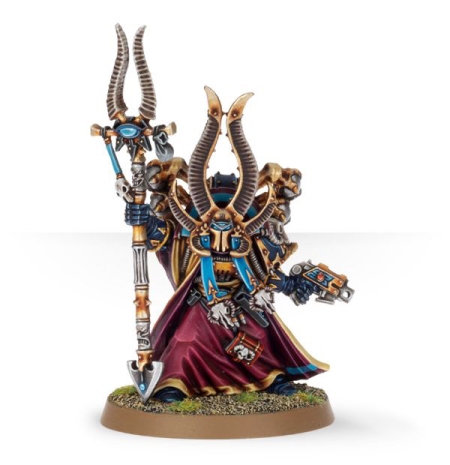
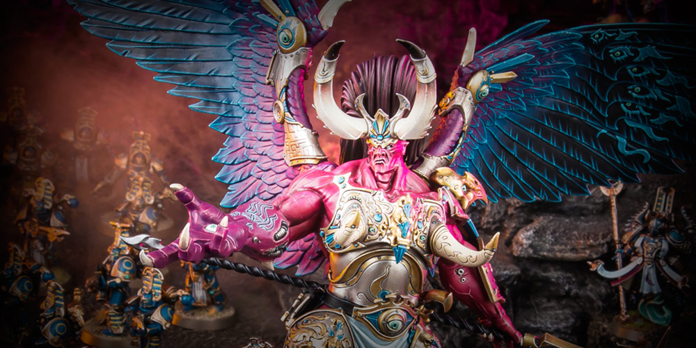
Magnus the Red, Daemon-Primarch of the Thousand Sons

thousand-sons-release-3So yeah, it seems like Daemon-Primarchs are now officially a thing in 40k. Good thing I already made one earlier this year 😉

But anyway, it’s obvious that this is a pretty exciting development, especially given the fact that our only look at the Daemon-Primarchs in model for so far were the respective Epic 40k versions — and the less said about them, the better…

If we look at the model at hand, I have to say that Magnus looks pretty much exactly the way I always envisioned him — well, except for the chicken feet, maybe 😉
But even an element as unexpected as the avian feet works pretty well for giving the model a Tzeentchian look without sacrificing any of Magnus’s impressive physicality.

It pleases me immensely that there is quite a lot of Wayne England’s interpretation of Daemon-Primarch Magnus in the model, because you just cannot go wrong with taking cues from Wayne England, if you ask me:

illustration by Wayne England

illustration by Wayne England

What’s more, all the changes made to Wayne England’s design certainly make sense: I already mentioned the avian feet above, and the inclusion of feathers on strategic points of the model (and the choice of replacing the classic daemon wings in the art with feathered wings) all enforce Magnus’ connection with classic Tzeentch imagery. These elements also make him look like a scintillating hellish bird of prey — rather fitting for Tzeentch’s favoured daemonic servant. One could argue that the finished model is almost too fabulous — but come on, which other Primarch would warrant a look as exalted as this, if not the lord of sorcerers? Well, Fulgrim perhaps, but we’ll be getting there, I suppose… 😉

The model is also pretty enormous, easily towering over even greater daemons (which probably doesn’t bode well for my Angron conversion. Bugger!):

thousand-sons-release-4
As is always the case, however, it’s the small things that make or break even a huge model like this, and GW has certainly put in the required work:

I really love the inclusion of three different heads, for one: The actual cyclopean face – for all its dorkiness – echoes the classic Epic model and the vintage depiction of Magus in the fluff. What’s more, the three different faces also mirror a particular scene in Aaron Dembski-Bowden’s Betrayer where Magus’ face seems to be jumping between different versions while you look at him — and I really, really love that little bit of lore represented in model form!

thousand-sons-release-5
Personally, I prefer the masked face, both for its mysterious and regal qualities and because it’s not quite as gnarled as the other two.

I also like the fact that we get the choice of arming him with either a glaive or a Kopesh. If you ask me, the sword seems like the more elegant solution, mostly because that huge ball of energy forming above the glaive’s blade doesn’t quite come together visually:

thousand-sons-release-6

I wonder if this “multiple choice” version of characters will happen more often in the future, as the classic approach is to have one version for a special character and no options whatsoever. Such are the liberties of plastic models, I suppose…

There’s also an incredible amount of detail on Magnus’s armour, and all of those embellishments don’t merely serve as decoration: It seems like there’s a real depth of symbolism here, with layers and layers of callbacks to the lore – or, indeed, to real world culture – for us to figure out. Wudugast has done a fantastic job of pointing out many of these elements in his aforementioned post, and it would be remiss of me to steal his work here, so make sure to give it a look.
thousand-sons-release-7
I wonder why his right hand is so freakishly big, though. Is there some explanation for this in the lore? Or is that just his literal Red Right Hand? (Badum-Tish! 🙂 )

Speaking of red, though, I have to say that the ‘Eavy Metal paintjob of the new model – while technically impeccable, of course – makes Magnus look a tad too pink for my taste. Fellow hobbyist Tzen is currently doing a paintjob in a darker red, and with feathers that almost look crystalline — I am really looking forward to the results! Check out his progress here.

All in all, I think Magnus is a really worthy first Daemon-Primarch, and I am really looking forward to seeing his brothers rendered in equally monstrous forms! At the same time, I cannot stop wondering whether was it really clever to release the Daemon-Primarch version before the regular FW Primarch version. I think there’s a very real danger of the “mortal” version ending up feeling slightly underwhelming now — oh well, I guess FW’s sculptors will just have to give it their best shot 😉


Ahriman

thousand-sons-release-8
After Eldrad Ulthran and Khârn the Betrayer, Ahriman is the third classic 2nd edition Jes Goodwin model to be given a redesign, and it should be obvious that these models are the ones to be nervous about, given the originals’ iconic quality.

The first thing to note, then, is that the model definitely reads as Ahriman, and in a bit of a surprise, the new version might actually be closer to Jes Goodwin’s original sketch than the classic version:

thousand-sons-release-16

Nearly all the iconic elements of Ahriman’s previous incarnation are accounted for: the horned helmet, the sorcerer’s staff topped with the same gazelle horns, the robes and high collar — even the pose is very close to the original! This is obviously the same guy, only in a slightly more modern version.

thousand-sons-release-11There are a couple of devations (or rather, evolutions) of the classic design, however: For one, the new model has much more depth and dynamism, whereas classic Ahriman is very much a product of his time: I remember a WD article where Jes Goodwin said that Ahriman was one of the first 40k models to get actual additional pieces for added depth instead of being single-piece. Now the new model continues this approach and adds lots of depth to the character, making him look dynamic and like he has some agency while basically standing still:

thousand-sons-release-15

At the same time, the model neatly keeps the original’s arrogant pose — the addition of a disc of Tzeentch arguably even enforces Ahriman’s haughtly look: He’s just too important and powerful to merely walk.

Now I’ve never been a huge fan of the whole disc idea, which is why I appreciate the fact that a) the disc is an optional part of the model and it’s just as feasible to just have Ahriman on a base like the original version and b) the designer went for a less creepy crawly approach, making the disc look more like an arcane machine, which is a great fit for Ahriman’s character! And there’s even a scarab symbol on top of the disc — a very nice touch!

In fact, it’s subtle touches like these that really sell the model as an evolution instead of a mere retread of the older model: For instance, the buffalo skulls dangling from the stole around Ahriman’s neck on the original model, have been exchanged for more delicate occult doodads, which seems like a much better fit for the character.

However, I do have some very minor quibbles with the model, even if all of these are plainly based on personal preference: That sorcerous flame in Ahriman’s left hand is a bit of an acquired taste for me — but can arguably look amazing when painted well. While I love the rest of the official paintjob, though, the flame just doesn’t work all that well in green and blue. Or maybe I just miss the hand holding the bolt pistol? For some strange reason. It’s a surprisingly iconic part of the original model for me.

On a related note, I find myself going back and forth over whether I like the original helmet better (I think I do — it has something to do with the precise proportions and angles of the faceplate).

But when all is said and done, Ahriman stands as possibly the best re-envisioning of a classic Jes Goodwin model to date. Much better than Eldrad and even with a bit of an edge over the new Khârn. And what’s simply beautiful is that – due to the new model being so similar to the classic version – the excellent mix of similarity and contrast between the 30k and 40k versions I described in my last review remains firmly in place:

thousand-sons-release-12


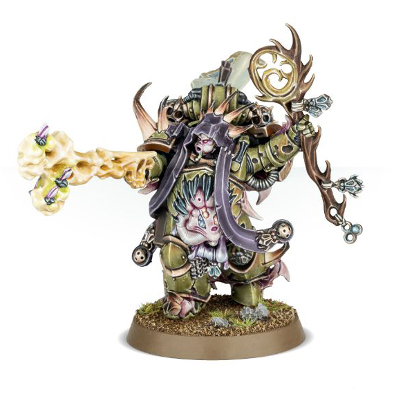
Thousand Sons Exalted Sorcerers

thousand-sons-release-31
I love building characters, so this is really the perfect kit for me, allowing for three highly individualised sorcerers with lots and lots of options. One thing that strikes me about the kit is how many mutated bits are featured, as this seems like a slight readjustment in the fluff to me — didn’t the Rubric of Ahriman stop the flesh change outright in those with enough sorcerous power? Then again, maybe the millennia in service to the god of change were just too much. Anyway, expect lots of mutations of the avian variety.

In all fairness, however, those bitz are fairly excellent, especially the plethora of staffs and heads we get out of this kit!

thousand-sons-release-36
thousand-sons-release-37

There are also many charming little touches on those parts: The sorcerous hand using an ectoplasmic flame to reload a bolt pistol might be a bit much, but I do love the avian skulls on this guy’s stole seemingly snapping at the enemy:

thousand-sons-release-34
Also, can we just spend a moment in quiet contemplation at the beautiful way the cloth has been attached to the same sorcerer’s backpack:

thousand-sons-release-34b
In fact, the backpacks are probably one of the best parts of the kit, making the best possible use of Egyptian and Tzeentchian elements to create a unique silhouette for each of the sorcerers — this is an excellent touch that we need to see more of, especially because, for the most part, CSM backpacks only used to be a bit of an afterthought so far.

I also rather love the avian feet on this guy:

thousand-sons-release-33
Upon closer inspection…what exactly is keeping him aloft, though? Is it sorcerous power or…erm, something altogether more nefarious?
thousand-sons-release-33b

Nice as the three models featured on the product page are, however, I almost prefer the alternate builds that were showcased earlier, on GW’s new community site:

thousand-sons-release-32
Even when the sorcerers are more mutated than their ghostly brethren, they are arguably more disturbing when fitted with concealing helmets, leaving their exact nature ambiguous (I also really love the raptor-like look of the top left guy with that sweet Mk. VI variant helmet).

Maybe the biggest strength of this kit lies in how it gives you the freedom to build your sorcerers exactly how you like them best: As overly mutated, massively corrupted creatures of chaos. As masked and mostly unchanged, yet also subtly touched, master planners. Or as something in between.

Whatever you do, the models you end up with will look powerful and arcane, and there’ll be a really nice contrast between their warped, dynamic forms and their more regimented Rubricae brethren. This is easily one of the most tempting parts of the release for me, in spite of the odd moment of silliness 😉


Thousand Sons Rubric Marines

thousand-sons-release-19In a way, this was the one kit they just had to get right, even moreso than Magnus and Ahriman: The Rubricae are what defines the look of the Thousand Sons more than anything else, so they had to make this count. And if you ask me, boy did hit it out of the park with the new Rubric Marines!

I remember the first Thousand Son I ever saw, one of Jes Goodwin’s iconic set of models for the cult legions, appearing in the colour section from the 2nd edition rulebook:

jes-goodwin-cult-legionariesIt’s utterly astounding how – even decades later – those four guys still stand among the best models ever designed for the cult legions. And the Rubric Marine was just lovely, hinting at an arcane and mysterious legion through visual cues: You got an excellent idea of what the legion was about simply by looking at this model, without ever needing to read a single line of background.

During the 2000s, we saw a dedicated Thousand Sons conversion set, based on some of the design cues from that first proof-of-concept model. And while the conversion set was nice enough for its time, it never really lived up to the quality of Jes Goodwin’s original Thousand Son. Then several Space Wolves models tantalisingly featured the iconic helmet as a trophy – trampled underfoot, no less – and ever since I have been hoping for a true successor to that first Rubric Marines.

And the new guys really fit the bill:

thousand-sons-release-22
Seriously, I just love them! The strongest part of the cult legions’ design was always in strong silhouettes and clear visual cues. And the new Rubric Marines absolutely deliver on that, clearly reading as Chaos Space Marines, followers of Tzeentch and Thousand Sons at the same time. The helmet designs are just beautiful, and the flowing lines of the armour trim really takes the classic CSM design to the next level. The added tassets are an excellent little touch. I also love how the new Rubric Marines have their own dedicated backpack designs!

As a  bonus for fans of the Horus Heresy, there’s a marked resemblance between the Rubricaes armour and Mk. IV power armour, which begs the question: Will we go back to certain armour types being associated with certain cult legions? I would really love to see bulky Mk. II Plague Marines and massive Mk. V World Eaters whose armour is covered in studs and bolts!

In addition to the beautifully redesigned bolter-wielding Rubricae, we also get some new weapon options, which certainly makes sense:thousand-sons-release-23
Well, those flamers certainly look Tzeentchian to me! 😉

Plus we also get the most arcane looking rotary cannon ever witnessed by Man:

thousand-sons-release-24
If I have one minor gripe about the kit, it’s merely the fact that the new sorcerer cannot quite match the excellent old one, a model only available as part the classic upgrade set:

thousand-sons-classic-sorcerer
What can I say: I just love that guy 😉

But all things considered, this is a stellar new kit for the Rubric Marines, and arguably a cornerstone of this release. Excellent work!


Thousand Sons Scarab Occult Terminators

thousand-sons-release-26
Oh wow, dedicated traitor legion Terminators — yet another pleasant surprise! Even better, though, is that the Scarab Occult Terminators look completely unlike vanilla CSM Terminators and yet perfectly read as Thousand Sons. Make no mistake, I am really fond of the classic CSM Terminator look, spikes and tusks and all. But for the Thousand Sons, something more elegant and less barbaric seems far more appropriate.

By the same token, all the strengths of the new Rubric Marines are present on the Terminators as well, — in fact, there’s a palpable sense of visual coherency between the two kits, with many of the design elements (the Keltaran helmet crests, the flowing lines of the armour trim, the avian skulls and weapon designs) appearing across both kits, allowing you to field very different troop types that still look like they belong to the same traitor legion.

thousand-sons-release-28

thousand-sons-release-29And in another parallel to the Rubric Marines, the Scarab Occults’ Terminator armour also clearly resembles an established Heresy era armour mark, namely the Tartaros pattern. Again, this seems like a very interesting (and possibly promising) design decision that I hope will be used again on possible future traitor legion releases — it also really enforces the notion that the armour dates back to the actual Heresy era, which certainly makes sense, given the fact that the victims of Ahriman’s Rubric have been bodyless automata for millennia, with no need (or even ability) for changing their armour.

Let me also mention that the squad champion/sorcerer just exudes a sense of elegance and terrible dignity

thousand-sons-release-27Also, chain kopesh swords FTW! 😉

Between the Rubric Marines and Scarab Occult Terminators, it’s possible now to build a Thousand Sons army that is visually distinctive, with a strong identity for the legion. And that’s really a brilliant development for CSM players, even moreso considering the quality of the new sculpts!


Tzaangors

thousand-sons-release-38

The inclusion of these guys is certainly a bit of a surprise — although I guess all the signs were there to see back when plastic Tzaangors first appeared as part of the Silver Tower boxed set. Even so, it’s certainly nice to have dedicated Tzeentchian beastmen available now, mostly because the classic goatman look doesn’t really fit the Changer of the Ways all that well…

While its’s fairly obvious that the multipart Tzaangors share many common design traits with the Tzaangor models from Silver Tower, I would argue that the multipart models are not quite as good as the Silver Tower guys: The latter just seem to have the more iconic poses — which is easier to achieve with a monopose model, of course, but what can I say: Just look at those fantastic poses:

Silver Tower Release (10)
On the other hand, there’s a real benefit to the multipart nature of the new kit that goes beyond the usual flexibility offered by plastic kits: It looks like kits that cross over between 40k and Age of Sigmar are now officially a thing again (even beyond the Chaos Daemon line of models, that is), as a closer inspection of the sprues reveals an extra sprue that can only be considered a dedicated 40k weapons sprue, when the other sprue seemingly has the more medieval looking weapons intended for AoS.

thousand-sons-release-43
All things considered, these guys are maybe the weakest parts of the release for me. But I think we can let it slide, both because we didn’t even expect 40k Tzaangors in the first place, and because the proper Thousand Sons models make for a pretty robust competition. When all is said and done, it’s still a nice kit that provides Tzeentch players with some interesting new option!
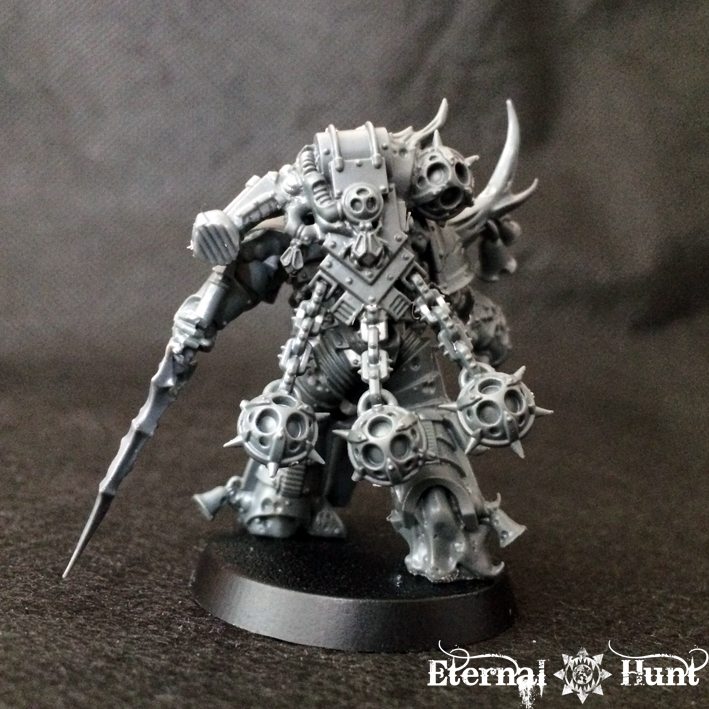
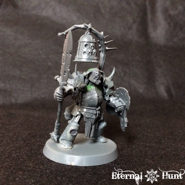
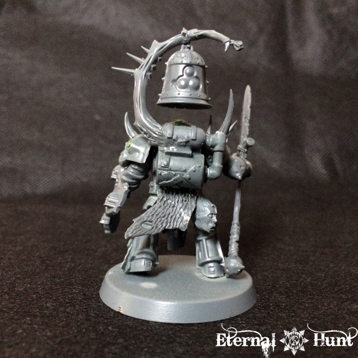
 

Conversion options

Oh man, the chaos community is going to have a field day with these new kits! And I, for one, can hardly wait for talented folks like Aasfresser, for instance, to put the new bitz through their paces! For now, let me just jot down some quick ideas for possible conversion projects involving the new models:

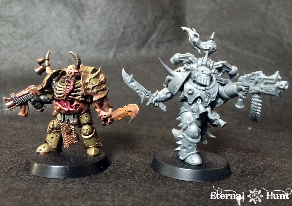
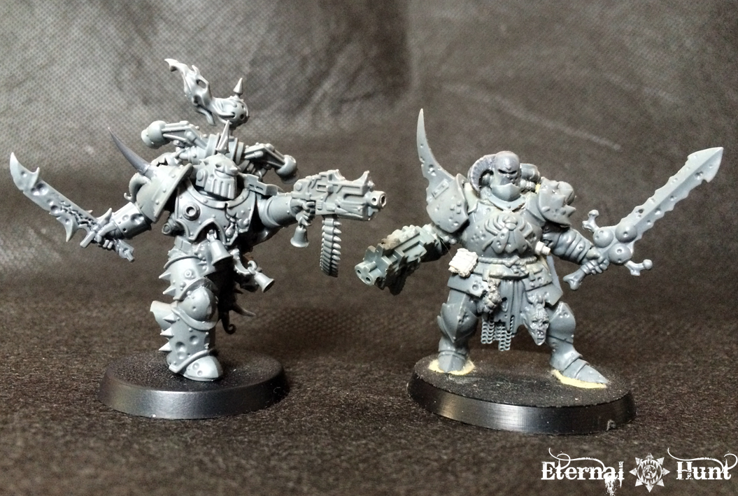
First up, the obvious idea: I think that many parts of this release would work brilliantly for 30k Thousand Sons as well!
To wit:

  • the Scarab Occult Terminators could be used as, well, 30k Scarab Occult Terminators with next to no need for further conversion. In fact, the kit almost seems like the first dedicated unit for a specific legion to appear in plastic and not as a FW upgrade set. I would like to see more of this, please! 😉
  • by the same token, it’s also possible to use parts from the Scarab Occult for 30k Thousand Sons Praetors and officers.
  • there’s also nothing stopping you from you from sprinkling some of those new Thousand Sons bitz on top of your 30k Thousand Sons, seeing how the legion grew more and more towards the arcane by its latter days as a loyalist legion, and how things like the iconic Keltaran crests had obviously taken root within the legion far before the present day of 40k (at least judging by their mention in “The Talon of Horus”, which is set not too long after the Heresy). The brilliant thing is that you bascially get to decide “how far gone” you want your Thousand Sons to be: Have they only started their descent? In that case, just add a staff or helmet from the new kits here and there. Do they already embrace the sorcerous powers more actively? Then you can use more and more 40k Thousand Sons bitz to create Marines that look more and more like sorcerers –and have begun to display physical changes.
  • expanding on that last part, mutation bitz from the Exalted Sorcerers could be used to depict 30k Thousand Sons in the throes of the flesh change.

I also think that all of those gorgeous helmets, mutation bitz and arcane doodads also allow for quite a bit of crossover between 40k and WFB/Age of Sigmar: So why not use some of those helmets and bitz to create a warriors of chaos warband that really looks Tzeentchian?

Back to 40k – and, arguably, INQ28: The Tzaangor weapons could be used to turn Khairic Cultists from Silver Tower into Tzeentchian cultists for the 40k setting. Or you could use the same weapons to give chaos cultists from Dark Vengeance that extra bit of Tzeentchian oomph.

And finally, why not use those Tzaangor bodies and heads to create your own, strangely avian xenos species for INQ28 — or your Tau army? Speaking of Tau, maybe those Tzaangor parts would also be promising if spliced together with Kroot bitz?!


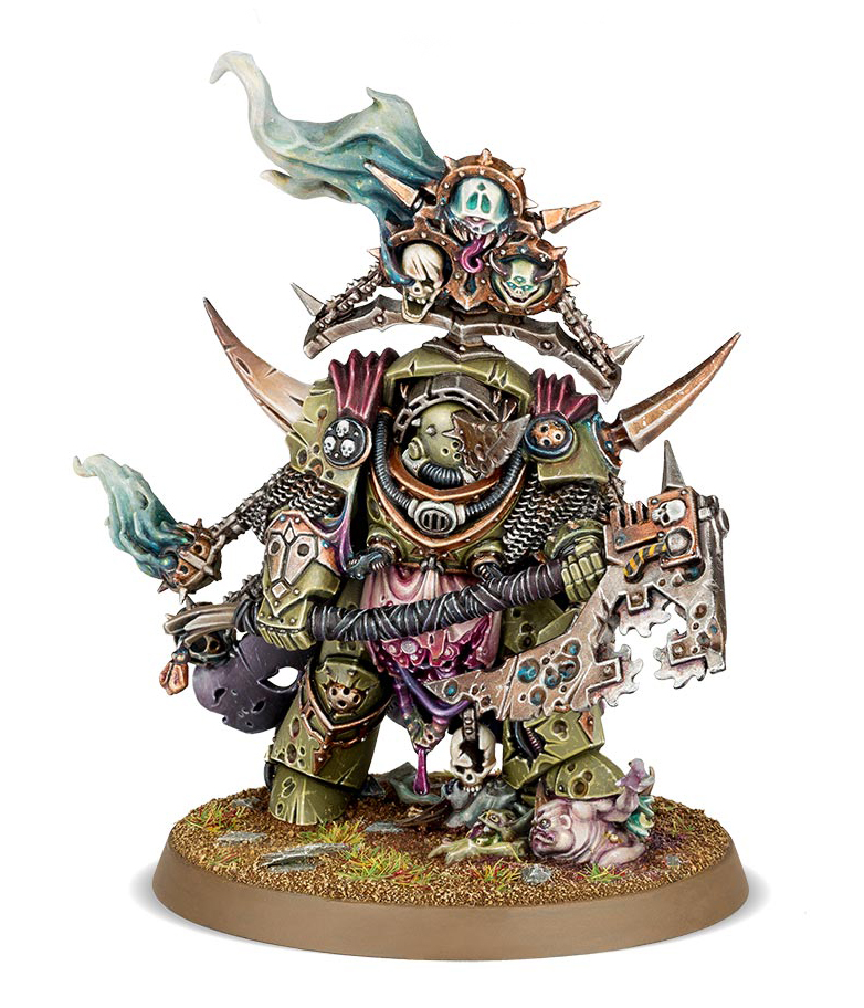
All in all, this is a truly stellar release for CSM players, arguably made even better by the fact that it wasn’t really expected in the first place. Even if we don’t get any more modernised CSM models, it’s already a great addition to the armouries of chaos. Certainly more than I expected in every conceivable way!

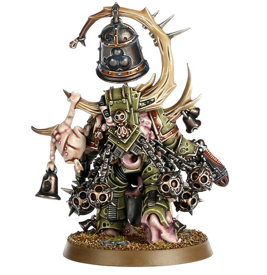
I also love the fact that a chaos god other than Khorne or Nurgle is finally getting some love. I’ll never tire of Khornate and Nurglite kits, of course, but let’s just face it: It was really somebody else’s turn this time around 😉

At the same time, it won’t surprise you to learn that I really wish for more plastic cult troops (we *need* new Khorne Berzerkers! And Plague Marines!) and updated vanilla CSM. Let’s just dream for a moment: How awesome would it be if we could only get this amount of quality for the rest of the traitor legions — maybe only one kit each? We can always hope! And if nothing else, if the sheer quality of the new Thousand Sons is anything to go by, we may be in for quite a ride indeed!


So what’s your take on the new models? Are you as pleased as me or did you expect more? And are there any conversion ideas you would like to share? I’d be happy to hear from you in the comments!

As always, thanks for looking and stay tuned for more!