Feet on the ground! Painting my Chaos Knight, pt. 4
So, what about that Chaos Knight I’ve been working on for quite a while now? While recent events have slowed down work on the model a bit, I do have a fresh update for you that should give you a pretty good idea as to what the finished model is going to look like, so strap yourselves in!
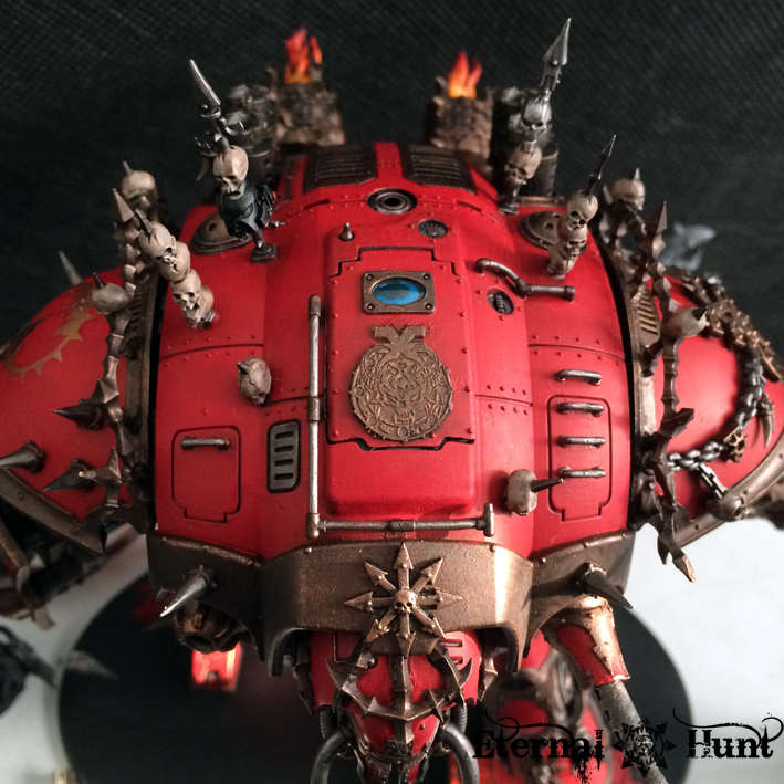
When we last encountered the Knight, the entire top carapace was still only undercoated black, so this was the next area I needed to tackle. Thankfully, I had purchased a Citadel L Base Brush from my FLGS, which made it far easier to produce an even coat of red on this huge area. Here’s what the Knight looked like with the carapace painted red and the first details picked out:

While I realise that not everyone will like the armour plates painted entirely in red, this was very much my plan from the beginning — and, like I said, if it had been my call, the fabled “Red Period” at GW would never have ended 😉
I’ll still need to add some further detail work, but I’ve already finished the top hatch. Here’s a closer look:
And while I was at it, I also had some fun with the interior:

Hey there, Baron Harrowthorne! 😉
Speaking of which, seeing FW’s recently released Knight Scion has made me pretty happy, seeing how I seem to have come pretty close to the “official” version of a Knight pilot with my own, kitbashed version — at least when it comes to the position and the controls for the Knight:
 Oh, and another detail: Those of you paying close attention may have spotted a suspicious model in that picture of the Knight above. This little guy here:
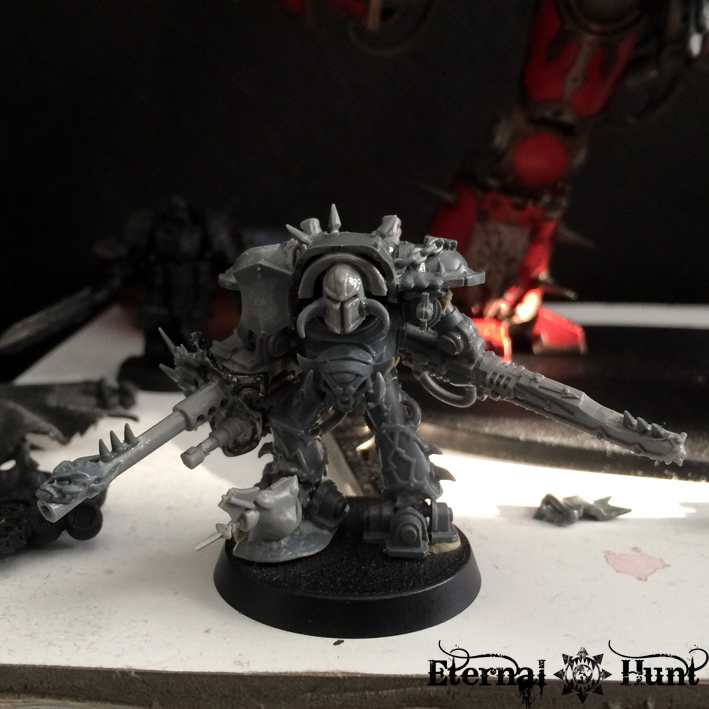
This is a small “Gaiden Project” dubbed the “Chibi-Knight” — a roughly Epic-scaled version of my Chaos Knight, inspired by fellow German hobbyist Paule’s excellent thread about kitbashing Epic Titans. Coming up with a model to match the bigger version fairly closely has been a lot of fun, and I think I’ve done a reasonably good job of it, wouldn’t you agree? Anyway, expect to see more of this little guy at some point 😉
And that’s where I stopped working on the Knight for a while when, well…real life happened. But this past week, I’ve felt the need to do something creative and fun, so I’ve come up with this:

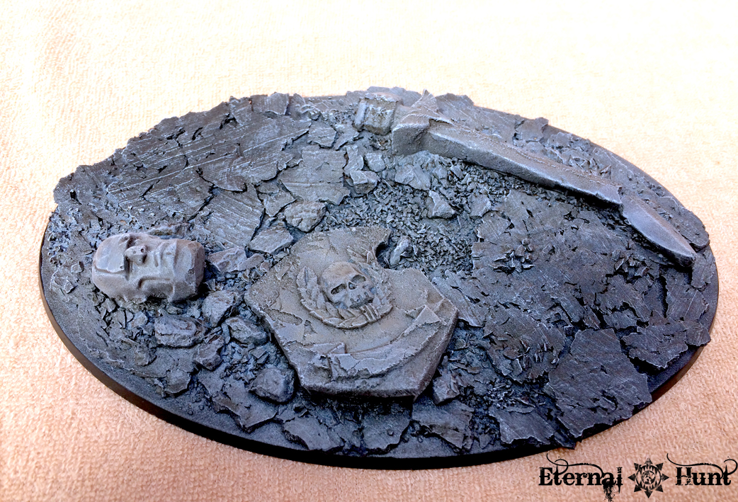
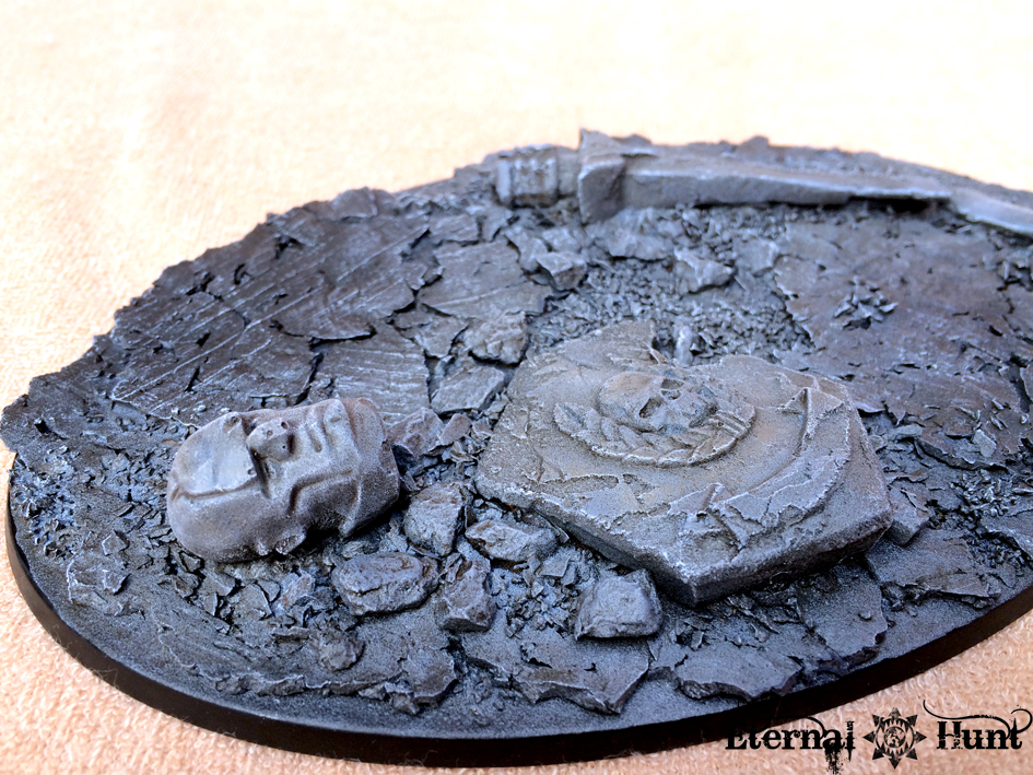
As you will probably have guessed, this will be the base for my Chaos Knight. As it happens, I’ve been going back and forth regarding what to put on the base: On the one hand, it’s really easy to make bases of this size look tacky by overcluttering them. But the Knight deserved a suitable base. And yet. And still…
In the end, I realised that there are few things more emblematic of the crumbling Imperium of Man than a toppled and destroyed Astartes statue — plus the piece from the Honoured Imperium kit was a pretty nice fit scale-wise! So I went with that, and I am pretty pleased with the general direction, if I do say so myself.
So here’s the – still unfinished (!) – Knight, provisionally placed on top of it:


And a closer look at the way the model and base interact:

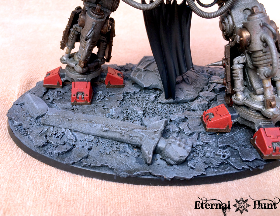
While the base is suitably impressive for a model of this size, I think it does a pretty good job of not drawing a way too much attention from the true star of the show. If anything, it may actually be a tad too monochromatic, as pointed out by my buddy Biohazard. Yet I don’t want to screw up both the painting I have so far and the fact that it matches the bases of my World Eaters — any ideas?
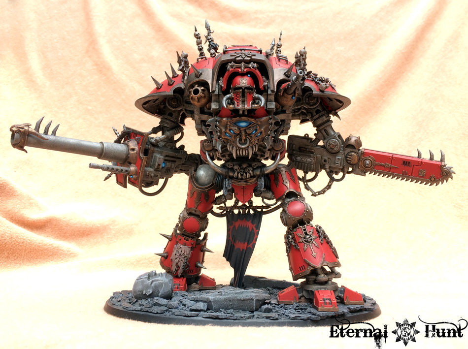
Oh, and there’s one last thing I did: I finished the banner dangling between the Knight’s legs, using some decals to create a suitable design. The front received a World Eaters legion badge in red:


As simple as this design looks, it was a veritable nightmare to get right! I started with a decal from the FW World Eaters decal sheet, but it needed lots of decal softener and several coats of varnish to finally conform to the banner’s surface. And even then, what had been a rich, ox-blood red on the decal sheet turned into a prety off-putting shade of pink against the dark background, so I ended up painting over the decal several times, coloring in the legion badge, so to speak, with my brush.
Fortunately enough, the rear was far less of a hassle — in fact, designing some of the battle honours won by the Knight during its long years of service was actually quite a bit of fun! Take a look:

So, here’s the Knight as it stands right now:


When all is said and done, I am very happy with the way this guy is turning out, even though there’s still quite a bit of detail work left to do. Roughly speaking, I’d place the entire model at about two thirds done right now, although most of the stuff left to do is fairly minor detail work. But the Knight is shaping up to be quite the centre piece, wouldn’t you agree?

As always, let me know what you think! And, of course, thanks for looking and stay tuned for more!

September 30, 2015 at 09:11
If we could apply lovely to such a beast of a thing I would say it is lovely. But this is a Khorne Knight Titan, brutal is a better word. 🙂
Regarding the base I would go with adding some rusted barbed wire fencing, mostly smushed into the ground. Just enough to break things up.
Otherwise I’d dirty up the banner between his legs as it seems to drag along the ground as is.
October 3, 2015 at 14:02
Cheers, mate! And that is a very interesting suggestion regarding the barbed wire. Hmmm… As for the dust on the banner, I am already on it! 😉
September 30, 2015 at 12:09
How about some sprays of blood coming from off the base, off screen as it were? After all, this is Khorne… A pool or two of dark mud might add some contrast too, as it is a very pale base, at least at the highlights.
October 3, 2015 at 14:04
Cheers, mate! As for the blood, hmm, I don’t think so — blood is a really easy effect to overdo, and seeing how this guy will already be getting some bloody handprints on his shin armour, I think I cannot afford any more blood 😉
September 30, 2015 at 12:18
Beautiful work, man – that’s looking fantastic!
October 3, 2015 at 14:04
Thanks, man! 🙂
September 30, 2015 at 14:18
Nice work man! I was already going to ask about the small chap in the picture glad that got covered and I was pleasantly surprised to see he was a scaled down version of the knight itself very nice!! First thing I would like to point out is that the brass areas look very good, I can’t tell if its the actual lighting or the highlighting you have done but it looks ace! I think you have a good amount of base coverage, but it does come out monochromatic. Off the top of my head three things come to mind you could do: 1) Add some tattered prayer scrolls to the statue bits 2) Possibly add some barbed wire in the vicinity of the statue bits (In my head it looks solid but I know you want your bases to be uniform 3) further shade the dark areas of the base and possibly add some variation on the statues colors as they seem to blend in with the rest of the rubble. There is a picture in one of the Horus heresy visions books of a corpse in some fallen rubble that is monochromatic, that’s the image this brought to mind. I agree its best not to over clutter but the monochromatic tones give the base an “unfinished” look. I have no complaints about the Knight looks badass and can’t wait to see it finished!
October 3, 2015 at 14:05
Thanks, Eli! Some very sound suggestions regarding the base — in fact, I’ve been working on it with various washes since publishing the post 😉
September 30, 2015 at 14:26
The Knight is looking ace, did you have any luck with your Hand print experiments?
AS for the base I echo the others, though I’d bronze up the statue parts. go with a dark grey then add some verdigris and use metallics only at the points where it it’s broken.
Colours something like this.
http://www.google.co.uk/imgres?imgurl=http://www.buddhamuseum.com/bronze-3/black-mahakala-0502.jpg&imgrefurl=http://www.buddhamuseum.com/bronze-buddha-mahakala_6761.html&h=500&w=410&tbnid=moNbyLaidPsCEM:&docid=SoGhW7_8RVwQeM&ei=SdQLVra2C4H6UITKq4AE&tbm=isch&ved=0CCUQMygFMAVqFQoTCPb-5v_fnsgCFQE9FAodBOUKQA&biw=2065&bih=862
October 1, 2015 at 15:17
Agree with the bronzing…maybe add some greens for verdigs, and then bronze up some edges poking through. Lots of different things. It’s a base, experiment. If you don’t like it, it’s a base, just strip and redo again!
October 3, 2015 at 14:10
Cheers, greggles! I am working on it! Like I said, though: The statue isn’t supposed to look like metal, so no verdigris this time, sorry 😉
October 3, 2015 at 14:06
Thanks, Dan! One thing, though: I didn’t want the statue to look like it was made from metal, though: In fact, I’ve gone to great lengths to give the various parts a stony texture (take a closer look, and I believe you’ll see what I mean). That said, there will be some more contrast on the base.
October 10, 2015 at 10:57
Thats cool, Been using a 768p tv for one of my work monitors so getting the fine details can be hard to see, crazy how we all got so used to HD quality that HD ready looks pants.
I like the idea InqMikaelovich suggest lower down, moss or lichen effects can realy work and are easy enough to do just depends on how recent the statue was knocked down.
Either way I know it’ll look ace and can’t wait to see the results, expecialy haviong seen the B&C thread with the extra details. wow, can’t wait for the next update.
September 30, 2015 at 15:23
Great work! I love the battle honours detail on the back of the banner (people never do enough with the backs of their banners for some reason). Nice touch.
October 3, 2015 at 14:07
Thanks, Odie! That part was so much fun, actually. And I figured that, since I was doing a (Knight) Titan, I might as well go the whole way with it 😉
October 1, 2015 at 00:38
This project is a lot of fun to follow. The decals turned out spectacular, and I’m excited to see how to details turn out.
Are the arms magnetized? It seems like the angle of them changes, but then again I may be looking at it weird.
October 3, 2015 at 14:09
Cheers, mate! You’re quite right: The arms can still be taken of and reposed at will — in fact, the Knight is constructed in such a way that it isn’t even neccessary to magnetise the arms: The construction holding them in place is pretty sturdy without any further need for reinforcement. And I think it’ll be nice to keep them that way, in order to be able to align the gun correctly during games and stuff like that.
October 1, 2015 at 09:20
Hang on… sorry, just had to pick my jaw up from the floor. Dude, this is amazing work – I love it! Great use of colour (that turquoise spot colouring is excellent), great pose, great detail… Love it! I see what you mean about the base – a ‘fallen banner’ might be a nice way to add a dash of colour without distracting too much? Maybe one to match a particularly cherished opponent?
October 3, 2015 at 14:09
Thanks a lot, Alex! 🙂 I fear a banner might be too much of a show stealer, though 😉
October 1, 2015 at 21:35
That is looking lush! So glad you saw your conviction through and did the carapace red. The effect is quite subtle (even though its red!) and whole model looks…..well, it looks just right. Great work!
October 3, 2015 at 14:11
Haha, yeah, I was a bit unsure about all that red, but I think it checks out quite alright in the end. Anyway, thanks for the kind words! 🙂
October 4, 2015 at 16:16
I like the way he looks like he’s about to kick the statue’s head like a soccer ball (or, for those of you in Europe, would that be a “football”?).
Other than that, what about a little bit of brush/moss/lichen/other decomposer type plant breaking down the statue? It looks like you painted it as stone, so rust and verdigris wouldn’t work unless you added paint to make the pieces look metal, but you could still give it a reasonable decaying look without doing so, I think.
October 5, 2015 at 06:10
Hello kraut, long time follower and borrower, the knight looks amazing, love the red, the base is great just a few bips n bobs is all it needs. Maybe even a zerker that’s crazy enough to be running in front of the knight? Anyway, just wondering about those fantastic spikes on the right shoulder and leg, what kit did they come from? Thanks and keep up the “Red” work.
October 5, 2015 at 12:25
Thanks, mate! The spikes are from the fairly old (but still available, I believe) WFB Orc boyz, if I remember correctly.
October 12, 2015 at 14:35
[…] PART I PART II PART III PART IV […]
April 18, 2016 at 18:55
[…] I PART II PART III PART IV PART […]