Tutorial: Grimdark Glamour Shots
Today’s post will deal with something slightly different — but don’t fret: We will of course be talking about our favourite hobby, after all. In fact, I have prepared a small tutorial that some of you may find helpful. So what is this about?
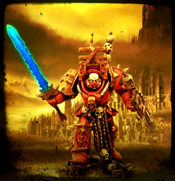
When my recent writeup about Lord Captain Lorimar was complete and published, I went back to the photo montage I had made for the model and made a couple of tweaks, resulting in a picture that I like even better than its predecessor:
Now when I posted this on my various forum threads, two things happened. One, fellow hobbyist Kythnos asked me for a similar picture for his own Iron Warriors Warsmith and two, several people inquired about my recipe for creating images like this. And I have actually been posting edited images involving my models for quite a while now, although I certainly don’t consider myself an expert when it comes to image editing — in fact, I am still very much finding my feet when it comes to various techniques.
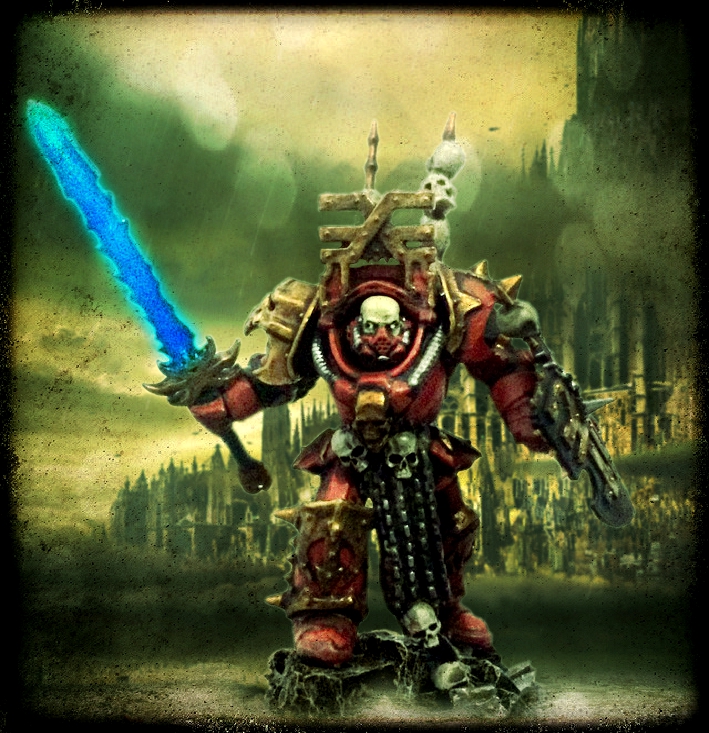
But I did make that photo montage for Kythnos after all. Here’s what it looks like:

And I realised that, while I may not be an expert, I have managed to come up with a relatively reliable recipe for creating this kind of pictures — brilliantly dubbed “glamour shots” by Flint13 in a recent post.
Now I realise that those pictures may be a somewhat divisive feature: When I first posted a couple of them, some of my readers seemed concerned that these would replace “normal” photos of miniatures on this blog. But these pictures aren’t a replacement for good, honest miniature photography, and certainly shouldn’t be treated as such. This is rather about exploring your models (and the characters they represent) from a different angle, about imagining how they would actually look on the battlefields of the 41st millennium. It’s about creating the dramatic, often hilariously overwrought, scenes we all know and love from the background. And, by extension, it can also become an additional way to start thinking about your models as characters rather than mere playing pieces, and I’ve always been a huge advocate of that!
Anyway, to make a long story short, what follows is a small tutorial about creating suitably dramatic and garish “glamour shots” for your models. I’ll give you the short version (for now), although we may actually revisit parts of this in more detail at some point.
Anyway, before we start, a disclaimer of sorts:
- This doesn’t represent THE foolproof way of creating images like this, but just one way that has worked reasonably well for me. I am 100% sure that there are far more elegant and/or accomplished ways for going about this, and people who are more knowledgeable about Photoshop will probably laugh about my fumbling efforts — fair enough, I say. I am absolutely not claiming to be a professional here, and this is therefore a very “quick and dirty” approach.
- I am also definitely not the first person to do a tutorial on this, but have rather been very lucky to find some excellent tutorials by other people to get me started: A brief but excellent writeup by Tyler Mengel showed me the ropes, and fellow German hobbyist Talarion introduced my to Pixlr, making my life much easier in the process. So thanks must go to them as well!
- When it comes to procuring suitable backdrops for your photos, there’s a big temptation to just steal everything you need from the internet — and to be honest, I have occasionally been guilty of the same crime. However, I try to go for pictures that are (or at least that I consider) fair game, i.e. stuff that is freely available and in the public domain. I will occasionally use material from GW or FW themselves, admittedly, but as I have no plan of using any of this commercially, I hope this constitutes fair use (bottom line, please don’t sue me, GW!). But please don’t just go stealing other people’s work left and right, alright?
- Finally, I will be using Adobe Photoshop for the first part of this tutorial. Similar software is freely available (GIMP would be one example, and there is also the web-based version of Pixlr). Most major functions are fairly similar across various programs, and I am not going into the differences and kinks of the software here. Neither will I be focusing on the details: Using this tutorial will require some (very) basic knowledge of image editing.
With that out of the way, here goes:
What you will need:
- a photo of your model(s) in suitable quality, taken against a neutral background (preferrably white, grey or beige). The photo needs to be sharp, in focus and bright enough. There are some excellent tutorials about how to take good pictures of your models here and here, for starters.
- some kind of image editing software, i.e. Adobe Photoshop, GIMP or Pixlr or whatever else works for you.
- I will be using the desktop version of Autodesk’s Pixlr for the second half of this tutorial, in order to add effects and certain colour hues. This isn’t a necessary step, but Pixlr will make things much easier here, especially if you have little knowledge about Photoshop, and the software is free, so I recommend you download it.
And with that, we’re off:
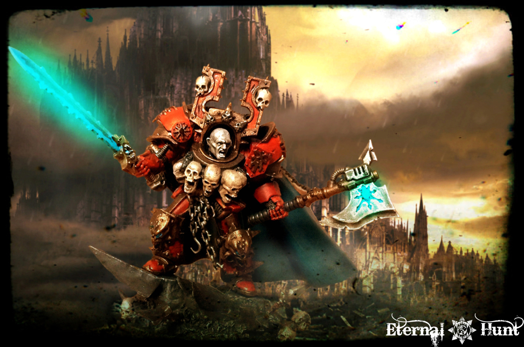
First up, I am going to use a picture of Biohazard’s Lord Malek Deimos — both because Biohazard probably won’t mind, and because I like the idea that he’ll end up with a cool picture of his Chaos Lord, because he’s my buddy 😉
So here’s the picture I chose:
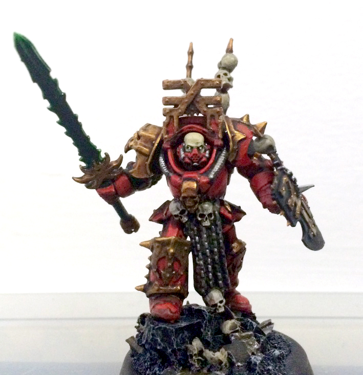
model built and painted by Biohazard
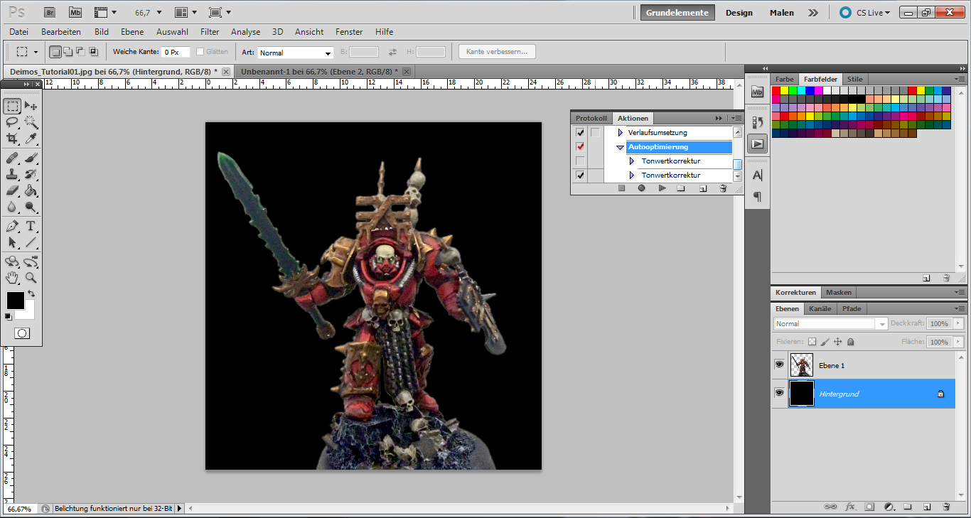
The picture is a bit more grainy than it should be, but it’ll do. It’s against a white background, which is great, because it will make cutting out the model far easier. If you want, you can play around with brightness, contrast and the levels a bit at this stage, in order to make the photo a bit more crisp and rich in contrast.
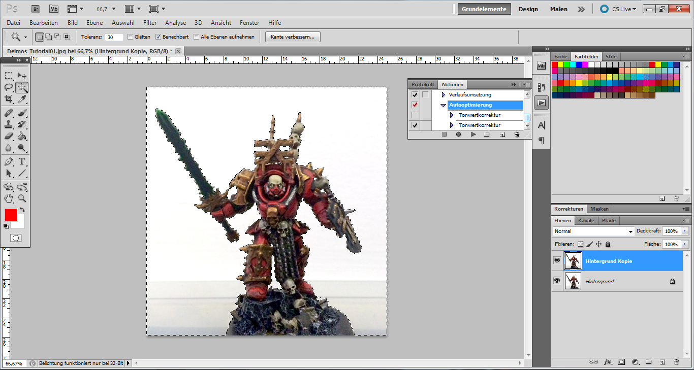
The first thing you want to do is to duplicate the layer on which your image is, so that you have the background layer (the original image) and another layer above it (also your original image, but that will change shortly). Select this new layer.
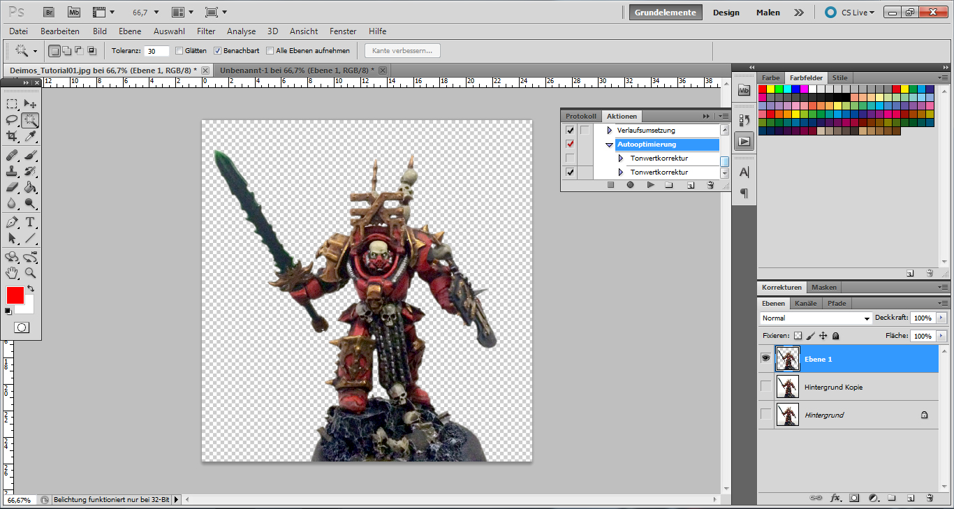
Now Photoshop (or any software functioning roughly like Photoshop) has a selection tool usually called the “magic wand”. What this does is to select a particular colour present in the image — which is why you want the background to be in a neutral colour. So select the magic wand tool and click on a part of the white background. It’ll create a selection. If you press Shift while selecting additional white areas, they will be added to your selection. The selection will be marked by a blinking border:
Don’t forget any white areas! There is also a way of having Photoshop auto-select every bit of white on the canvas, but that would mean all the white that’s part of the actual model as well, and we don’t want that. So make sure to select all the bits of white background, until it looks like the picture above. Then invert your selection (this function can normally has its own tab, or it can be found under “Edit”. Once you have done this, the border will be running around your model rather than around the entire canvas.
[I do realise of course that other kinds of selection tools exist, and if you’re familiar with them — great! However, for the sake of brevity, we’ll be sticking to the magic wand here 😉 ]
If you want the photo montage to look convincing, we’ll have to get rid of the last remnants of white background, reflections etc. So reduce your selection by one or two pixels. If you want to make it look even more believable, you can also add a slightly blurry edge to the selection (so the model won’t look quite as much like a cutout). Once you’re happy, copy the selection and add it into a new layer. At this point, you should have the original image in the background, the layer above (with the original photo’s background, but minus the actual model) and a third layer with the model as a cutout on top. Delete the middle layer, as we won’t be needing it any longer. And you should set the bottom (background) layer to invisible, so the canvas looks like this:
The little checkerboard pattern in the background shows that this area is transparent. To make things easier for you, you can fill the background layer with a solid colour (or create a new layer for that), because it will make the model’s edges easier to see. Like so:
Not bad, eh? But some remnants of the orignal background and some reflections remain. In the above picture, it’s very obvious on the arm holding the sword.
Now if you’re just in for the quick and dirty version, you can simply ignore this, but your model will probably end up looking like it has a halo in the finished picture. So in order to get rid of this, you select the eraser tool and choose a paintbrush with slightly blurry edges…
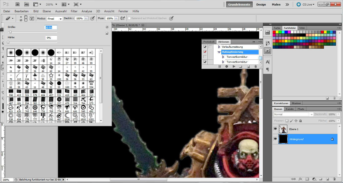
…then set it to a size you are comfortable with and carefully work away at those edges that look like they are glowing. Be careful not to take away too much and rather work in multiple increments! If you make a mistake, you can always undo your last couple of steps!
In the end, you will have a cleaned up version of your model:
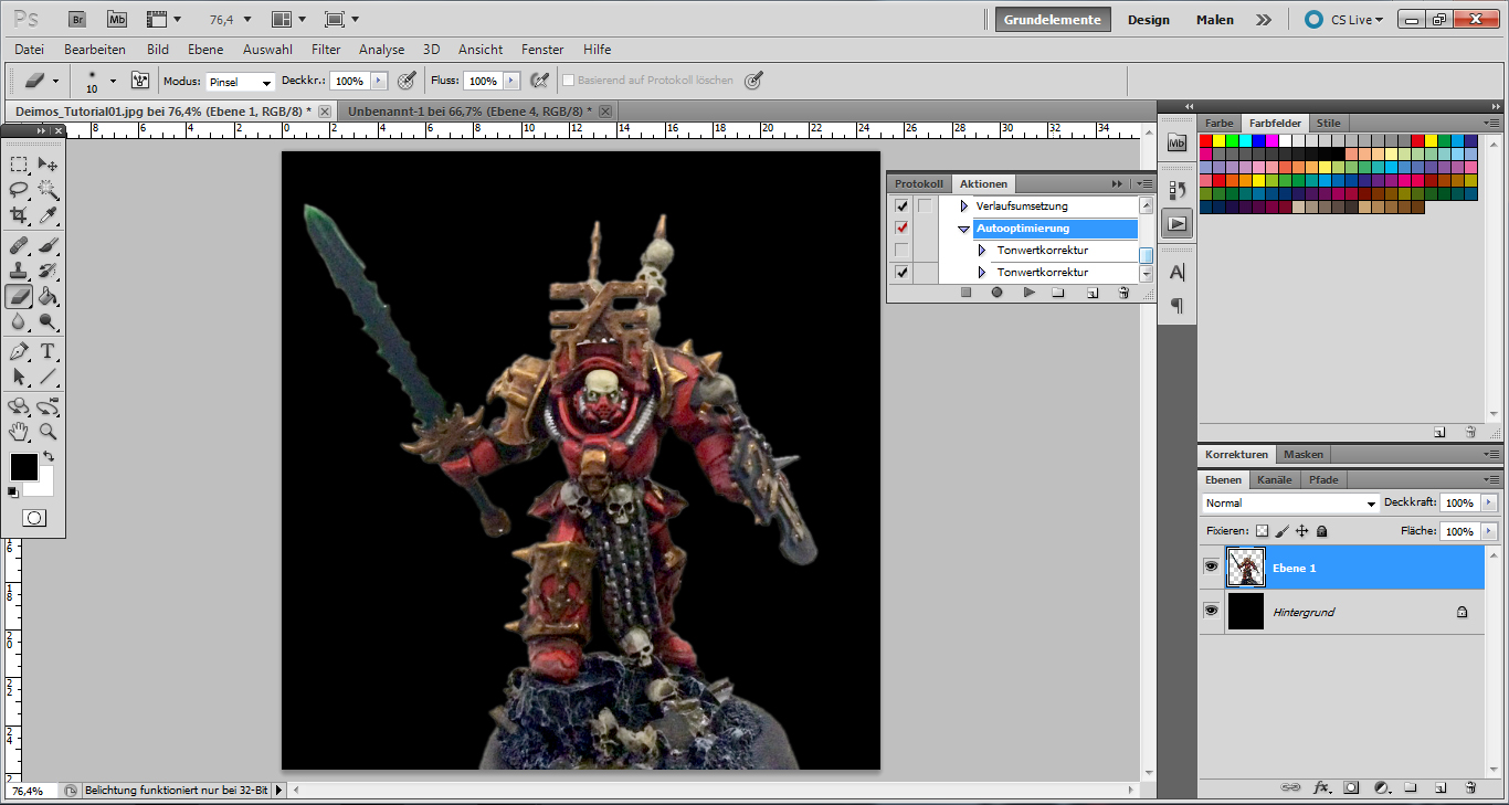
It’s a subtle difference, to be fair, but it’ll be worth it in the end — trust me 😉
Next step: the background. Find a suitable background image you would like to use (I chose a promo image for the Armageddon PC game, showing a hive that seems to have been mashed together using Google Images results for “gothic architecture” 😉 Copy it into your picture so it will end up in a separate layer:
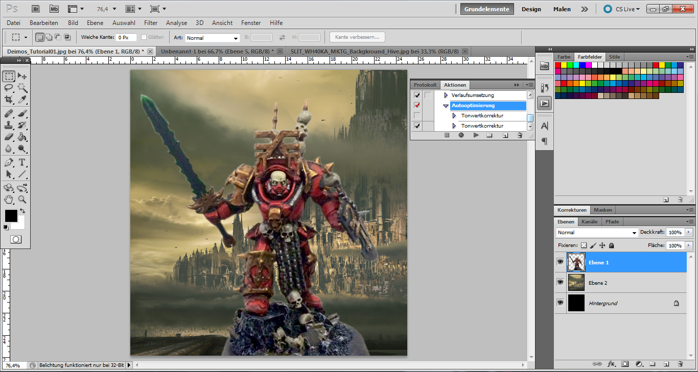
You will probably have to move the model around a bit at this stage, in order to make it fit the background. I also added in an extra step here and blended in some additional ground texture (I used a suitable photo I had taken, copied it into my canvas and just erased all the areas I didn’t need). Here’s the finished composite:
I also cleaned away the parts of the base that didn’t work — especially the black rim.
Okay, time for some colour correction: You can now bring up a menu to control the pictures colour hue and saturation with CTRL-U (for Photoshop at least). Try to make the model’s hue and saturation roughly fit the background (this is especially important if you have a very brightly lit model against a very drab background image):
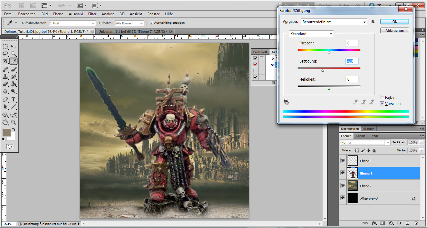
In this case, I wanted the model to look a bit more desaturated. Just play around with this — if you don’t like the outcome, you can always undo your actions.
The next thing that’s important is to use blur: In the above picture, the hive in the back is very sharp and crisp, while the model seems a bit fuzzy. So we need to blur the background. Select your background layer and select the “Blur” function (under “Filter”, normally). There’s a very handy tool called the “Gaussian Blur” that will let you select how strong you want the blurring to be:
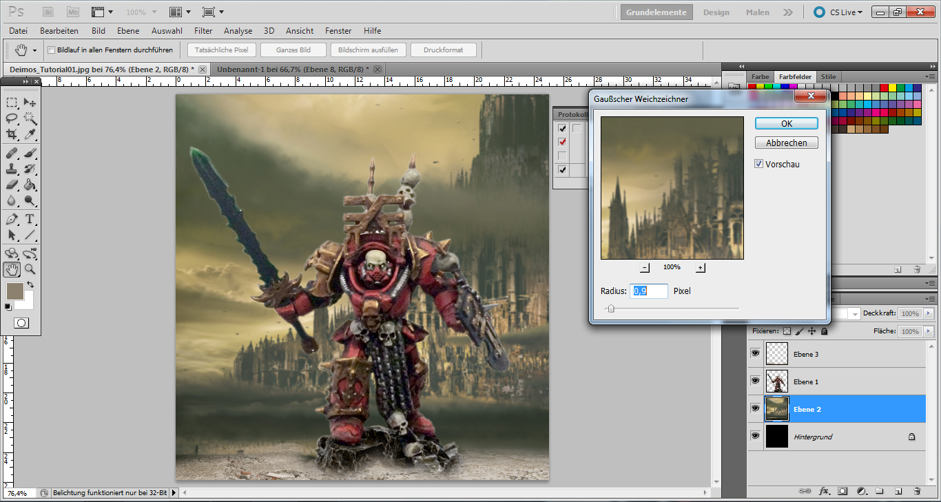
Once you’re happy with the background, give the layer with the model the same treatment — although with much less blur applied. This should only make the entire picture seem a bit more realistic. Make sure not to obscure any important detail on the model during this step!
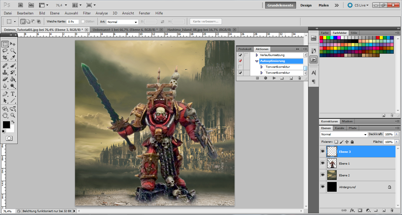
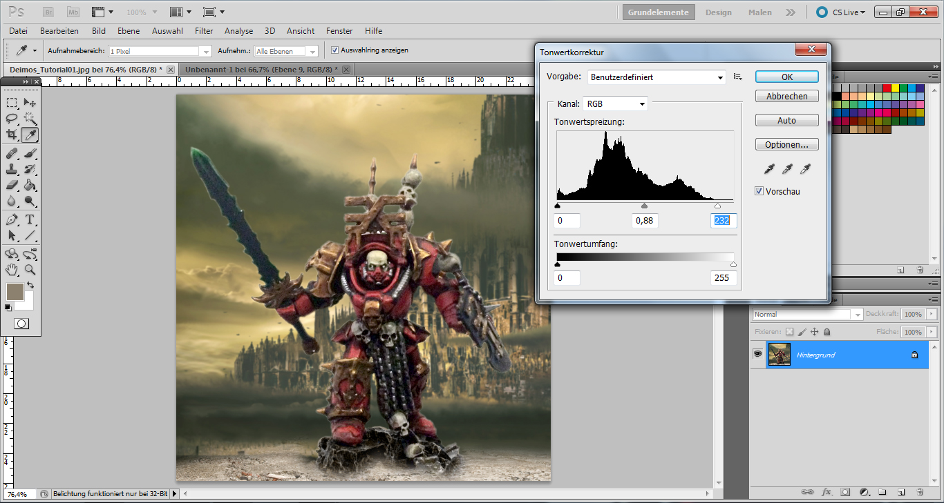
Once this is done, all that remains is to make some final adjustments to the picture’s contrast and levels:
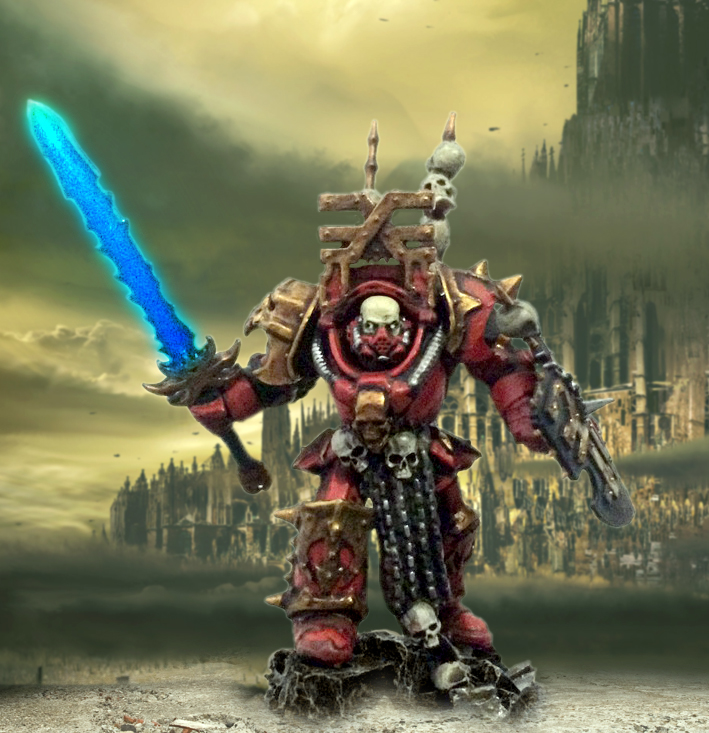
As an optional step, I wanted Deimos to have a glowing daemonsword in the finished picture. I won’t go into too much detail about the effect for now. Suffice it to say that I basically duplicated the model’s sword, copied it into a new layer and changed the colour. Like this:
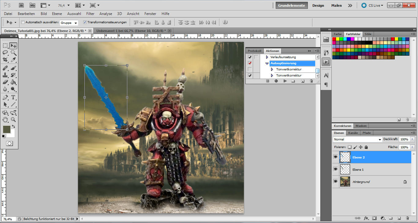
And since I wanted the glow to be pretty noticeable, the colour needed to be even louder:
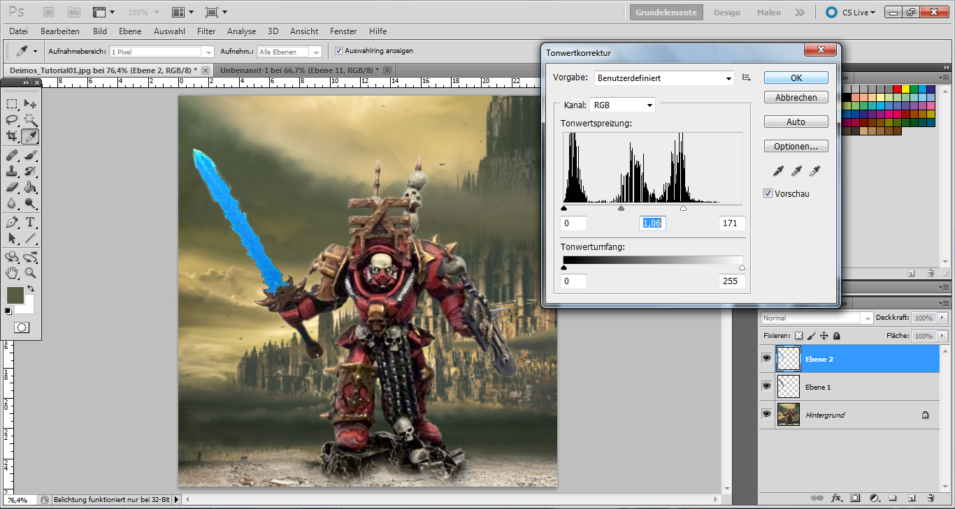
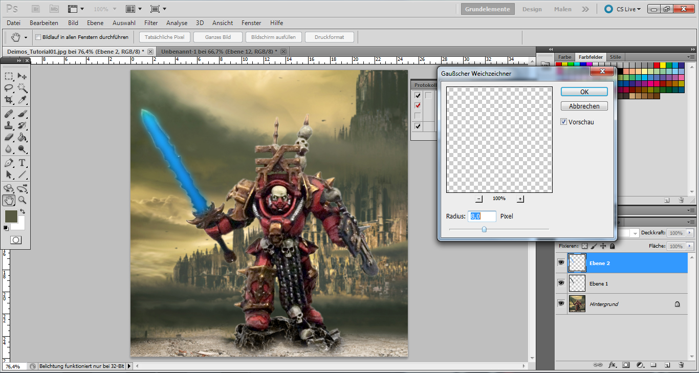
Since the blade existed on its own layer, I could safely play around with it without it affecting the rest of the image. When I was happy with the colour, I once again added the Gaussian Blur effect, and…
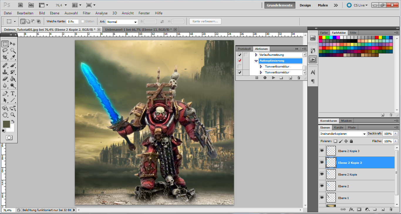
It ended up looking pretty cool. Now I duplicated this layer several times, changed the transpareny around and blended the various layers into each other until it looked like this:
Like I said, I might detail those steps further in the future. But since it’s an entirely nonessential step, let’s move on for now: One last adjustment of contrast and levels, and we are basically done with Photoshop. Here’s the end result:
Not bad, not bad at all! We could even call it finished at this point!
In any case, whatever you do, you should definitely save a copy of this picture, once you like the result. And you should always keep a separate copy of this version for future use:
Now while it would be possible to do everything else in Photoshop as well, you can make your life a bit easier by switching to Pixlr for the next steps. Pixlr is a bit of a one-trick pony in that it has been designed to add various effects and colour hues to photos — and precious little else. While this would also be possible in Photoshop, Pixlr makes it really easy for you because it does most of the thinking for you.
So let’s open up our picture in Pixlr.
And from here on out, the world’s your oyster, really: You can add any combination of pre-set colour effects. Like this:
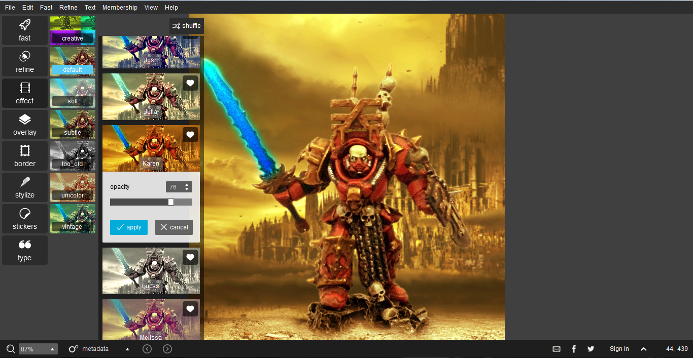
As you can see, I’ve gone for a fiery, reddish hue in this case. But most of the colour effects look awesome in their own way, so just play around with them until you’re happy. This is what my picture looked like after this step:
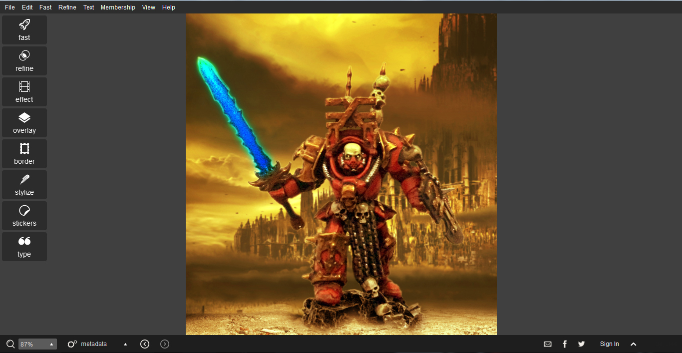
What’s really great, though, is that Pixlr also lets you add some effects, filters and borders. Some of them are downright horrible, some are pretty situational, but some – especially the various grungy borders – will make some of your earlier errors and inaccuracies in the picture disappear:
So layer some of these on top, and your picture will instantly look grittier and more realistic. Of course this is cheating: We are covering up our mistakes here. But as long as it looks cool… 😉
So here’s the finished picture, with one of my favourite borders added to top things off:
What’s really cool is that the picture could have looked completely different with a couple of different effect employed. Here I created a much more somber atmoshphere by using a different colour effect and a rain filter:
It goes without saying that you don’t even have to photoshop in a suitable background in the first place! If you have some 40k/tabletop terrain at home, you can just take photos of your models in front of it and work from there — if anything, this should make your life easier!
By the same token, making a photo montage of a single model against a background is really just the beginning. There’s nothing stopping you from trying something a little more involved, such as, say, making a composite image of your army ravaging a planet:
Here’s a Photoshop composite I made depicting a part of my World Eaters army in action:

Here I duplicated various layers of the image, making the same ten Khorne berzerkers look like an entire army. As you can see, I also added in a Helbrute and my Wargrinder. Oh, and I used the same background images that appear in Tyler Mengel’s post linked above (This picture was simply my attempt at reproducing his recipe for my own models). Even so, the image is hardly convincing, right? Not enough gritty realism and too many gooey areas of sub-par photoshopping…
Well, here’s what the whole picture looked like with a bit of Pixlr magic sprinkled on top:

Once again, the various filters and effects are doing a great job of camouflaging the many rough spots present in the earlier image. Like I said, it’s cheating — but we can use it in our favour here 😉
On the other hand, you don’t even need to create elaborate montages like that, either: Just use some of your existing photos and go play around with them a bit for starters! Some of my first experiments in this vein can be found here.
Whatever you do, remember that you are not trying to pass of your models as something they are not — you are just exploring another facet of the hobby. So give it your all and don’t forget to have fun along the way!
Thanks to Biohazard for – unwittingly – providing the material for this: Cheers, buddy! 😉 And, as always, thanks for looking and stay tuned for more!

April 15, 2015 at 12:46
I am now downloading Pixlr!
April 15, 2015 at 16:33
Have fun! It’s a great little piece of software to just mess around with.
April 15, 2015 at 14:04
Excellent Tutorial mate! Been wondering how you did those!
April 15, 2015 at 16:34
Cheers, Eli!
April 15, 2015 at 16:27
Very good tutorial and pictures. Not sure if your aware but you can achieve similar results by just taking a photograph with a good backdrop. It’s a lot quicker and the blending between the figure and background becomes seemless. You don’t need to be an expert with a camera either😛
April 15, 2015 at 16:36
Thanks, mate! While you are right (and I even said so in my tutorial), you will need suitable terrain and background material for such an approach, and for those who don’t have the resources, it can be easier to create those assets digitally. There’s also the logistics to consider: Actually arranging my entire army to make a photo shoot takes an awfully long time these days, so it may just be easier to create composites in Photoshop 😉
Like I said, there’s really no right way or wrong way: Both are viable approaches when it comes to exploring both your army and the 40k universe.
April 16, 2015 at 06:02
Excellent tutorial. Clear, easy to follow and excellent results. Really cool to see these characters in this new, more realistic way. I am normally not a big fan of the 40k aesthetic, but in their natural habitat 😉 they really look good.
April 16, 2015 at 11:45
That is very nice of you to say! 🙂
April 16, 2015 at 11:22
Hm, this looks shopped.
I can tell, from some of the pixels…
April 16, 2015 at 11:44
..and because I have seen quite a few shops in my time. Cheers, Jimmy 😉
April 16, 2015 at 19:31
You’re such a hipster mate 🙂 I like this concept, sure standard white/black backdrops are better when studying a nice conversion/paintjob. But this sets the mood, for inq28 I can see a lot of cool rpg possibilities.
April 16, 2015 at 23:11
I could see those as charater sheet illustrations. Is there not a 40k RPG? Would suit it perfectly and woudl also be much more appropriate then the usual white background shot.
April 18, 2015 at 18:01
Yeah, my thinking exactly! If somebody were to make a character sheet, source book or even a mini-codex for their own army, glitzing up the pictures a bit would make a lot of sense, wouldn’t it?
April 18, 2015 at 18:02
Like I said, mate, the objective is not to obscure dodgy paintjobs, but to explore a different side of the models — and what’s so hipster-like about that? 😉
August 10, 2016 at 11:13
[…] not advocating creating things that don’t exist on your model (unless you want to do a krautscientist visual effect). But if the photo isn’t doing you paint job justice, these tips can help bring some of it […]