Get out of my head, dammit! A closer look at The Burning of Prospero
First of all, forgive me for being phenomenally lazy over the last two weeks, dear readers — or rather, I wasn’t really being lazy but rather focusing my attention elsewhere (on the job, as it stands — YAY!). But it’s now time to return to the world of blogging, and what better occasion than to address the very obvious elephant in the room: GW’s second Horus Heresy boxed kit, The Burning of Prospero:
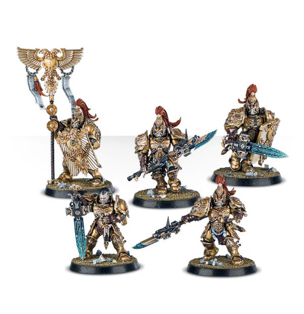
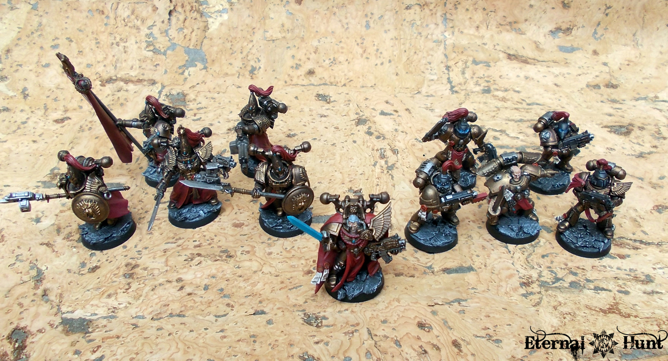
 Prospero has been dangled in front of Horus Heresy aficionados’ noses for quite a while now, and now GW performs a fearsome one-two-punch, turning the occasion into its own boxed set with dedicated rules — and lots and lots of delicious new little plastic men. Interestingly enough, the box seems to be continuing some of Betrayal at Calth’s most successful parts (i.e. giving us Horus Heresy Astartes in multi-part plastic) while also shaking up the formula in other respects (making the HQ models far less generic and adding shiny stuff like the Custodian Guard and the Sisters of Silence). So anyway, it has been a while since the last review, so let’s relish this occasion and use it as an excuse to take a closer look at the models as well as the possible conversion opportunities!
Before we begin, however, allow me to point you towards Wudugast’s article regarding The Burning of Prospero as a possible companion piece to this post. I’ve only skimmed his post so far, mostly for fear of ending up stealing some of his ideas and observations, but it seems like he raises some excellent points, and I know I am already looking forward to reading the whole thing, once my own post has gone up 😉
So let us start with the two HQ models that come in the box: Once again, we get one commander for each side. Now while Betrayal at Calth chose the route of actually naming the characters and giving them background while keeping the models themselves generic to the point of blandness, The Burning of Prospero goes the exact opposite way and opens up with one of the 30k and 40k universes’ big names:
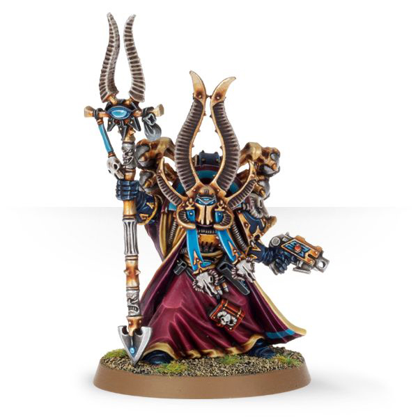
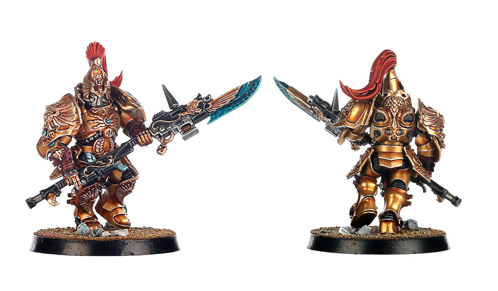
Ahzek Ahriman, Chief-Librarian of the Thousand Sons

Now that was quite a surprise, wasn’t it? Ahriman’s definitely the first major 30k character to be given a plastic incarnation, and I think Maxime Pastourel (aka Morbäck) has done a wonderful job with the model: The armour and detailing are very close representations of several pieces of Horus Heresy artwork, giving you the idea that, yes, this is definitely Ahriman! The blank faceplate is a bit of an acquired taste, but in all fairness, it has been part of the art for quite a while now, so it’s definitely an accurate representation. The engravings and symbols on Ahriman’s armour speaks of the Thousand Sons’ dabblings in sorcery while not overcluttering the model. And I really love how the flowing robes lend motion and dynamism to what is otherwise a rather static pose.
Of course with an important character like this, it’s also important to compare the 30k and 40k versions — and at first glance, there is very little resemblance between Maxime’s 30k Ahriman and Jes Goodwin’s classic 40k Ahriman:
 However, upon closer examination, it’s interesting to see how several elements of the 30k model do seem like a shout out to Jes Goodwin’s model: Maxime himself explains in the current issue of WD how the curved crest behin Ahriman’s head was included to mirror the horns curving from the 40k version’s helmet — and a similar thing can be said about his Heka staff, as the curve of its blade seems to subtly echo the curvature of the horns atop 40k Ahriman’s staff. The stole around Ahriman’s neck also mirrors a similar item on 40k Ahriman, and it’s fun how the wind seems to be blowing in the opposite direction on both models, respectively 😉
Beyond those visual connections, it’s also fun to compare what is different about the models, however, as there seems to be quite a bit of visual storytelling there: 30k Ahriman is all clean lines and lofty ideals, while 40k Ahriman seems like the quintessential, crooked and corrupt Chaos Sorcerer (much as he himself would probably deny any such notions). Looking at both models beautifully illustrates how far the character has fallen! It’ll be interesting to see whether a possible new 40k version of Ahriman manages to keep the same sense of narrative…
So yeah, I think this guy is pretty great! Anything else? I think that fallen Space Wolf on the base is a rather beautiful touch. And that might just be the best casting hand we have seen so far from GW — job’s a good ‘un!

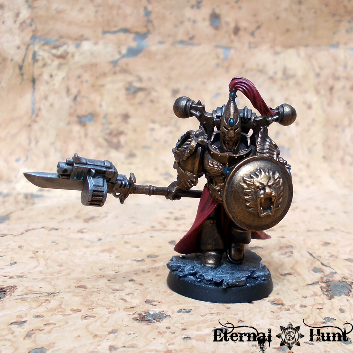
Geigor Fell-Hand of the Space Wolves

Ahriman’s direct opponent for the game is Geigor Fell-Hand of the Space Wolves, and while he’s a beautiful model in his own right, I don’t think he can quite keep up with his Thousand Sons counterpart. First of all, it would have seemed more plausible from a story perspective to include Othere Wyrdmake, seeing how he’s both an already established character AND Ahriman’s nemesis of sorts. But I imagine that would have messed with the game’s premise (sorcery vs. good, honest close combat), so we get a CC monster instead 😉
Now there are many things I like about the model: The artificer armour is definitely a thing of beauty! The shoulder pads are particularly noteworthy, in my opinion: The left one looks deliciously customised while the right one actually shows a Rogue Trader-era style legion badge — brilliant!
In spite of the model’s strong parts, I do have two gripes about Geigor: One, I think the model is too “Space Viking” by a long shot, especially since the Horus Heresy novels (Prospero Burns, in particular) have been doing such a good job so far of selling the wolves as something more interesting than mere generic viking types. And now here comes Geigor, in full Space-Viking regalia — poor guy must not have gotten the memo…
In fairness, I think this problem could be solved in part by making a few minor tweaks and ommissions: That back banner needs to go, if you ask me, and the claw seems a bit over-designed to me.
In fact, that’s my second gripe: I get how the designers wanted this guy to read as a close combat monster, but the combination of a massive lightning claw and a combat knife just seems off to me, somehow, especially in combination with the slightly wonky poses of the arms. I think a pair of claws or a massive sword and knife would have been excellent options, respectively, but the setup we are getting here just seems like a bit of a compromise. I remember that this guy was rumoured to be Bjorn the Fell-Handed, back when the first rumours of the boxed set surfaced, and his equipment would have made lots of sense in that light. But it seems like GW chickened out and turned him into yet another super-important character that we have never heard about — and in that case, a different combination of weapons would have worked better, if you ask me.

Don’t get me wrong, though: Geigor’s still a beautiful model that should work well both in 30k and 40k armies. He’s just not as good as Ahriman 😉
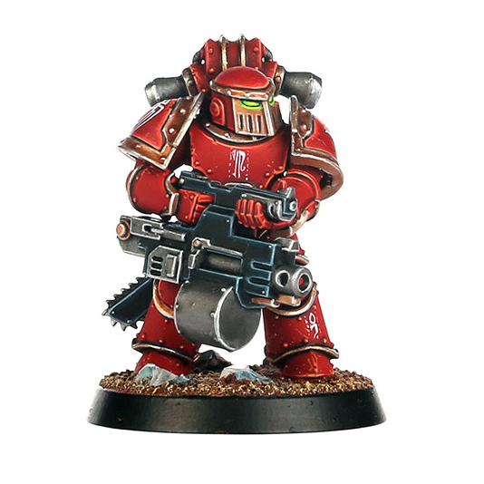
Tartaros Terminators
 Getting a full squad of plastic multi-part Cataphractii out of the deal was one of the most pleasant surprises about Betrayal at Calth — and now the new boxed set follows suit and gives us a squad of the other iconic heresy-era pattern of Terminator armour. And it seems like GW’s sculptors have once again done a good job of recreating the design in plastic, at least where the amount of detail is concerned.

Now I have to admit I am not a big fan of the Tartaros pattern, but that’s just me. Even so, I cannot help wondering whether these are actually a bit clunkier and more angular than their resin cousins. In any case, I do think the models end up looking a bit silly if the shoulder pads are placed too low, however. Just check out this guy:
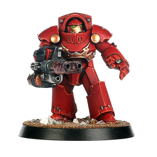
Beyond those observations, it looks like the kit comes with just as much customisation as the Cataphractii — and we even get some choom out of the deal! 😉 I also like the extra detail on the sergeant’s armour, which is something I would have loved to see on the Cataphractii as well!
All in all, this is another rock solid plastic rendition of heresy armour, and I imagine many people will be really happy with these guys! My lack of appreciation for the general design of the armour means I am not perfectly sold — but I do think the plastic Tartaros Terminators provide some excellent conversion fodder. But we’ll be getting to that in a minute…
Tactical Marines in Mk. III “Iron” armour

Where the regular Astartes are concerned, the inclusion of plastic Mk. III armour is actually the most exciting part of the boxed set for me! Iron armour is possibly my favourite heresy era armour mark — even moreso than Mk. IV. There’s just something about the very archaic look of the armour and the added mass that’s immensely appealing to me for some reason — maybe it’s the fact that the heavyset Mk. III armour captures the massive, archaic feeling of the classic Wayne England Horus Heresy artwork like nothing else?
Anyway, these guys look great as a squad, and it’s cool that they are getting the whole tactical squad treatment (with all the options that entails) once more. Granted, though: If you are not into Space Marines, then this is just the umpteenth tactical squad — but then I guess you wouldn’t exactly be this boxed set’s chief target demographic, either 😉
While the basic options and additional weapons are just like what we got with the Betrayal at Calth Mk. IV Marines, there are some additional tweaks that I appreciate: The models come with yet another bolter design (the Phobos pattern) that’s arguably a great fit for the archaic armour and makes for greater visual variety. And we get some chain swords for the Marines to wear at their hips, whoch is nice — and arguably a bit cooler than the somewhat bland combat knives. Maybe next time, we can get some actual chain sword arms, though? Thank you very much! 😉

The armour design itself seems to have been tweaked ever so slightly during its transition to plastic: The back of the backpack seems to have streamlined a bit, for once. There have been some tweaks to the helmet design. The shape seems ever so slightly different, especially towards the back of the helmet. And the main difference is that the eyes – formerly just eye holes, really – have been turned into actual helmet lenses that can be painted. This definitely makes sense, but the look it creates needs some getting used to.
 On the other hands, GW sweetens the deal by giving us several subtly different helmet designs, which is definitely appreciated.
Much as I love the design of the armour, however, my earlier criticism from the Betrayal at Calth release applies once more: Why not include some CC weapon arms (which would have made even more sense given the “physical power vs. sorcery” vibe of the whole game) and leave those to FW upgrade kits? I would have loved to finally see some close combat arms on a wider scale, especially with a kit that is otherwise so big on options and customisability.
Apart from this one piece of criticism, however, the Mk. III Marines are one of my favourite parts of the boxed set, and I can hardly wait to get my hands on them!
Custodian Guard & Sisters of Silence

Right, if you had told me one year ago that we would be seeing plastic Custodes and Sisters of Silence in an upcoming Horus Heresy boxed set, I would probably have laughed long and hard and called you a wishlister of the highest order. And yet, here they are. Of course their inclusion makes sense from a background perspective — seriously, though: I would rather have expected them to be releaed as resin models.
Of course the recently released Deathwatch Watch Captain served as a fair warning, what with wielding a Guardian Spear and all — I was actually going to suggest using him as the base for a Custodes conversion. Clever, GW, very clever 😉
The Custodes in particular have long been a bit of a holy grail for many hobbyists (myself included), and the attempt to recreate them in model for has spawned many awesome armies — with Dave Taylor’s seminal Custodes army being first among them, of course. All the more reason, then, to take a close look at the models:
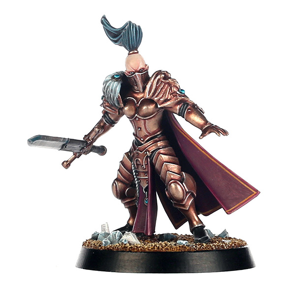
Custodian Guard
“Oh, right, now I understand: That’s what GW kept doing all those golden Age of Sigmar dudes for: They were merely test runs for the inception of plastic Custodes…” 😉
And, funnily enough, just when we thought we couldn’t stand any more huge golden dudes, GW gives us plastic Custodians — I wonder whether or not the irony behind it all was intended 😉
In spite of never appearing in model form so far, the Custodes have a fairly well-documented history, with quite a few depictions in the Horus Heresy art. Many of the most iconic illustrations featuring the Emperor’s bodyguard were part of the Horus Heresy trading card game and subsequently appeared in the collected Horus Heresy artbooks. Such as this piece:

I think it’s really astonishing how much of the visual splendour of the Custodian armour appearing in the image above has been faithfully reproduced on the actual models, from the iconic helmet design to the small details of the armour:
 I also really like how the armour seems decidedly unlike standard Astartes power armour, thanks to its very different lines, integrated backpack/reactor etc.
What’s more, you may not like those massively clunky bolt-pistol swords, internet, but if nothing else, there’s a precedent for them in the classic HH artwork, and they are just as clunky there:

The shout outs to the artwork don’t stop there, however: In his aforementioned post, Wudugast points out how much the bare head included with the kit resembles the various depictions of Constantin Valdor, Captain-General of the Legio Custodes:

All of this makes it seem like GW’s designers have really gone above and beyond in the attempt to do these guys justice and make them resemble the classic artwork as much as possible.
Even so, I will say that – beyond the sheer surprise of these guys being featured as part of a boxed set, and in plastic, no less – I did have to warm to the Custodes models for a number of reasons:
First up, they seemed so big and clunky to me: Sure, so many of the elements from the classic artwork have been expertly reproduced in model form, including the contoured armour that separates them from regular Astartes, but they still felt so massive to me at first glance, when some of the old artwork rather suggested something more lithe and elegant:

Of course John Blanche’s style is always rather open to interpretation, and the actual models usually end up looking fairly different, but there are also different pieces of art that have the Custodians look powerful, but in a rather elegant way. Just check out the guys on the far right in the picture below:

The actual models seem incredibly massive, however. Especially so in certain configurations:
 At the same time, I have come to like the bigger scale when compared to regular Astartes: Sure, it seems a bit strange at first, but the Custodians really should be between an Astartes and a Primarch in size — just imagine how stupid they would look surrounding the Emperor otherwise 😉
Still, the added mass takes some getting used to. But even as I write this, I can feel myself liking the models more and more. So I don’t think it’s much of an issue.
The other gripe I have doesn’t seem quite as substantial, admittedly, but it just keeps bothering me: Why are the Custodes models lacking any kind of robes or capes? This feels like a pretty baffling design choice on GW’s part, because if you look at the various pieces of artwork above, the crimson robes and capes seem as emblematic of the Custodes as their Guardian spears and their iconic helmets. Yet they are completely missing on the models, not even showing up on the Shield-Captain.
Now I do realise that this probably has something to do with technical issues and/or the way the models are assembled — but come on, these models are so spectacularly detailed, and you have gone out of your way to feature elements from the artwork. So how hard could it have been to add some (optional) capes on the sprue?
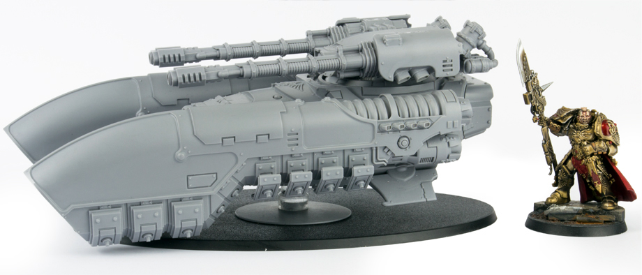
To add insult to injury, the Custodian appearing on the pictures of FW’s new antigrav tank even sports an added cape:
Looks like I’ll have to source some plastic capes, then — any suggestions? 😉
Of course having Custodes available in plastic also carries a bit of a bittersweet taste for me: After all, I happily kitbashed together a small Custodes army a couple of years ago, and I think I had a pretty good recipe as well:

And these guys have now obviously been rendered rather irrelevant by the new models — bugger! 😉 I really only have myself to blame, though, as my last models for the army were painted back in 2013 — I should have been faster!
All in all, these guys have grown on me quite a bit — and to actually see them as what looks like a multi-part plastic kit still seems kind of unreal to me. What’s more, the amount of detail on the various parts of the kit is really rather outstanding, and I imagine playing around with the bitz should be quite a bit of fun. Sure, the swords are too big (even if they are accurate), but at least we get a full set of Guardian Spears, so that’s not much of a problem. It really is a shame about those missing capes, though…
Sisters of Silence
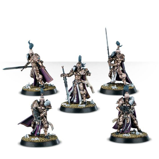
Where the Custodes depart from the artwork in some rather surprising ways, the Sisters of Silence seem like a perfect representation of the various pieces of artwork from the Horus Heresy artbooks: The design of the armour, the iconic weapon and facemasks, and the weapons wielded by the various squads in the artwork: all accounted for.
In addition to this, it’s always a treat to see some additional female models, and the Sisters of Silence are an especially welcome breath of fresh air in between all those bulky killing machines in the boxed set!
Another thing I really like about the models is that they feature all of the weapon loadouts we have seen in the art so far, allowing for swords as well as bolters, which is a very nice option to have (and also adds even more possible conversion parts).
Oh, and that Sister Superior ist just a stunning model — it’s going to take all of my (almost nonexistent) willpower to resist the temptation to convert her into an Inquisitrix…
Incidentally, a squad of kitbashed Sisters of Silence were part of my Custodes project as well, although I’d argue they are still close enough to the new models to actually still work once painted:

Do I see any negative points about the Sisters? I think some of the hair looks ever so slightly unnatural — but that’s not a huge problem and should be easy enough to sort out. In closing, let me just state the obvious, though: If GW can do these, they can do plastic Sisters of Battle. Just sayin’…
conversion options:
So much for the models, but what about possible conversions? I think the boxed set provides us with lots and lots of promising bitz and opportunities. Let me just outline some initial ideas for you:
Ahriman
I think the model could easily be turned into your own, customised Thousand Sons Librarian or even Praetor, for that matter: Just a head and/or an arm swap, and you are there. By the same token, he would work really well as a Chaos Space Marine Sorcerer in 40k: His armour is just ornate enough to work, and adding some spikes, trophies and chaotic symbols as well as a suitably chaotic staff and head shouldn’t be a huge challenge.
Geigor Fell-Hand
Like Ahriman, it should be easy enough to turn him into a custom Praetor with a new head, new arms or what have you. It’s also important to point out that the thing I consider the model’s biggest weakness (his over-the-top Space Wolfiness) is what makes him a great fit for a 40k Space Wolves army.
Given the amount of detail on his armour, I think it would be pretty difficult to convert him into a member of another legion. However, I might eventually try to turn him into a member of my Traitor Wolves. We’ll see…
Tartaros Terminators
I am pretty sure we can look forward to all kinds of crazy kitbashing involving these guys, especially if it comes to recombining existing parts to create new (or customised) marks of Terminator armour.
Possibly the most interesting thing about the models, however, is how they provide excellent parts for true-scale conversions! My first true-scale Marine, Praetor Janus Auriga, uses Tartaros legs, and they work really well for true-scale Marines because there are few visual cues that actually make them read as Terminator legs, making for very uncomplicated conversions. By the same token, I have seen some very convincing true-scale conversions making use of Tartaros torso pieces, so I definitely think that true-scalers across the blogosphere will appreciate these new toys. For instance, I can hardly wait for Apologist to get his hands on these guys… 😉
Mk III Marines
It’s easy to imagine how versatile a tool these will become for Space Marine players — after all, they should work great in both 30k and 40k, and it’s easy enough to mix and match with all of those plastic parts now available. This is great because it allows for extra flavour in your Space Marine army, regardless of which legion you are playing. It also means that you can now create a plastic Horus Heresy Astartes army without having to rely on a single armour mark for most of the models. What’s more, mixing different parts will lead to a more improvised, ragtag appearance that would be a great fit for specific legions (yes, World Eaters, I am looking at you! 😉 )
I also love the fact that the Mk. III Marines would arguably work really well for Chaos Space Marines as well: The added detail and mass make them look just archaic and sinister enough, and some legions immediately come to mind — such as the Death Guard, Iron Warriors or World Eaters.
Man, I really want to get started on those guys…
Custodian Guard
Well, these would be great fíf you wanted to build a suitably massive Inquisitor, of course, but I am pretty certain that we are going to start seeing actual Custodians appear in INQ28 and Necromunda games, especially if they happen to be set on Terra 😉
Beyond that, I am already considering using leftover Custodian parts to turn some of those Sigmarines into yet more Custodians — this should be interesting! And finally, those very same leftover parts should make for excellent conversion fodder for Space Marines and Inquisitorial retinues alike — those shields alone are almost worth it! Invictarii, Breachers or Honour Guard, anyone…?
Sisters of Silence
I predict a bright future for the Sisters of Silence models, especially among converters and the INQ28 crowd: Additional female models are always a much-appreciated resource, and it looks like the new sisters could be the legitimate heirs to the female Dark Eldar Kabalite Warriors and Wyches when it comes to building female assassins, death cultists and Inquisitorial operatives. Beyond that, like I said, the Sister Superior looks like she would make a teriffic base model for an Inquisitrix. And if you have already given up hope that GW will ever release plastic Sisters of Battle, then these girls might be your final way out 😉
So what’s the final verdict? Back when Betrayal af Calth was realised, my main criticism was the generic look of the models: I realised that this choice arguably ensured that the box would have a wide appeal to more people, but the lack of character still felt like a problem, especially with regard to the HQ models. The Burning of Prospero addresses this criticism, giving us squads that are once again generic enough so as to be useful to everyone, while imbuing the HQ characters with a lot of character. And then they added some of the most eagerly awaited Horus Heresy troop types on top of it all in a move that seems to have been plucked from the big all time wish-list in the back of my head — well played, GW, well played indeed!
With regard to the Horus Heresy setting at large, I think the writing’s definitely on the wall now: GW seemingly wants to move the Astartes squads to plastic and leave the special upgrade kits and characters to Forgeworld. At the same time, we have now seen the first important character in plastic, and we have proof that the Daemon-Primarchs (or at least one of them) will be produced as plastic kits. So I think we can expect a sizeable part of the future Horus Heresy output to be produced by GW proper (and in plastic) at this point, and I applaud that choice. I realise that not everyone is quite as enthusiastic as me about this change, since many hobbyists seem to fear a sellout of the setting (to that I say: No shit, Sherlock 😉 ) or a decline in quality. But if the boxed sets are anything to go by, I do not think there’s that much to fear.
If anything, it’ll be interesting to see what comes next: Additional armour marks in plastic? More named characters as clamshell versions? And let’s not forget the Custodes and Sisters of Silence: I feel myself being drawn back to that one massive piece of classic artwork time and time again:

This hints at additional troop types, such as Terminators and jetbikes, to name just a few. And with the models we have now so clearly inspired by classic artwork, the obvious question is: What if this is just the beginning…?
Wishlisting aside, though: What we have here is another very tempting Horus Heresy starter box. And how does the new box compare to Betrayal at Calth? I think that, between the two, Betrayal at Calth is still arguably the better “starter kit”: The contents are a bit less exciting, but also slightly more useful. That being said, the new box still seems like a more refined sequel: If Betrayal of Calth was the teriffic proof of concept, The Burning of Prospero is GW’s pièce de résistance — at least for now…
So what’s your take on the new boxed set? What do you like or hate about the new models? And do you have any conversion ideas you would like to share? I would love to hear from you in the comments section!
And, as always, thanks for looking and stay tuned for more!

October 26, 2016 at 19:20
Well, this release certainly has conversion potential by the boatload, doesn’t it? Some really cool and unexpected goodies from GeeDub here – I’m still digesting it all tbh! The new Termies are rapidly growing on me, especially in TS colours – they look like baby hulk-buster iron men! Can’t wait to see what the army of clever converters on the interweb make of all this 🙂
October 28, 2016 at 13:04
Cheers, Alex! I hadn’t really noticed the Hulkbuster connection, to be honest, but I can certainly see it now that you mention it. Still not sure about the Tartaros pattern, though: It always seems like the design is less than the sum of its parts somehow.
November 2, 2016 at 12:46
I feel like the tartaros pattern seems “unfinished”, like they forgot to put on the pauldrons or something. I could possibly grow to like them a bit more if they all looked like the sergeant. but for my DG, I’ll stick with cataphractii.
November 5, 2016 at 15:51
Yeah, the Cataphractii armour definitely seems like the more iconic Heresy era design, even in its slightly watered down model form (when compared to the even more archaic look in the old artwork). That being said, I have since seen the Tartaros bitz firsthand, and they should be even more useful for true-scale conversions that expected — even suspiciously so, in fact. I’ll be taking about this in more detail in a future post, I imagine…
October 26, 2016 at 20:02
This box is sooooooo difficult for me to resist. I love the MkIII a ton. I have had a plan to use MkIII the base for 40k Death Guard for sometime, but the cost of the resin models kept me away from it. 40k era Iron Warriors is the most obvious use for them. I also agree, World Eaters would work quite well.
I would love to start 30k’ing, and this is making it easier.
October 28, 2016 at 13:05
Haha, I doubt there’ll be any chance to resist this — at least that’s how I feel about the Mk III Marines. In fact, the only really question is how many of these guy to turn into 30k World Eaters and how many to use for building 40k World Eaters… 😉
October 26, 2016 at 22:17
A wonderful review, as always.
The Heresy Era Marines aren’t actually all that interesting to me (which is surprising, given that I play Loyalist Marines. I guess the new Deathwatch models just were too perfect for me). However, I agree with almost all of your points about them. My biggest hope here is that, if you get them, the Iron armour will mean that we will be seeing more of your excellent Iron Warriors. 😉
As for the Custodes, I think they could mesh rather nicely with your existing models, if you add some points to connect them visually (as you said, capes would be a good place to start. Maybe Anvil Industries could help you out here? http://anvilindustry.co.uk/Exo-Lords/Cloaks-and-Loincloths ) and convert them to represent a special forces squad of sorts. In all honesty, your Custodes are the most defining visual I have of the faction (and, indeed, are the reason I love the Custodes at all), and, in my head, these Custodes simply take all the elements of your Custodes that I love and dialed them up to eleven. Kudos to you, sir.
((Speaking of hulking men in golden armour, however, you have yet to give me your thoughts on my attempt at a Golden Legion Deathwatch marine. Should you approve of him, I have almost finished the Vanguard Veteran Squad he is a part of and am very excited to post them to my blog. The only thing you should know is that he will have a wreath added to his helmet and a Jump Pack on his back.))
As for the Sisters, I suspect that these are a prototype for Sisters of Battle/Adeptas Sororitas. It wouldn’t make sense to have 2/3 Inquisitorial Chambers Militant present in plastic (indeed, it didn’t even make sense to have 1/3), so I would be surprised if Games Workshop weren’t working on a suitably dramatic re-release for us. Not that I would want the models, but it would be fun to watch the community.
As always, brilliantly said. Congratulations of the job!
November 2, 2016 at 01:15
Cheers, mate! I don’t quite share your optimism about my Custodes, seeing how the new guys are so much bigger and all, but maybe there’ll be a way to turn them all into one big, happy family, after all 😉 We’ll see. Glad you like my Custodes, though!
As for your Golden Legion guy, aw, man, yeah, I totally realise I still haven’t gotten back to you about that — sorry, I am a terrible person (no kidding). Will try to write something at the weekend. Seriously! 🙂
November 2, 2016 at 01:50
Wonderful!
October 26, 2016 at 23:25
I always appreciate your reviews. Thank you.
I was talking to Thistle and Neil earlier about converting a SoS into an Inquisitor. I even suggested that we do another group thread converting/painting challenge called “Pimp my Sister”….though I decided that has a slightly different ring to it than “Pimp my Wizard”
I am massively impressed by the Sisters because its a handful of human female models (I immediately bought a set off a bits site). My hope is that the bolters are a slightly smaller scale to Astartes bolters. I do wish that the designers had made the flamers a little more interesting like in the artwork, like the ones you made. Plus a couple of sci-fi elements to the armour/swords would have been welcome.
The Custodes are good but not amazing. Mainly for the reasons you mentioned above; they seem so bulky and they are missing the cloaks and tabards of the art, it helps break up the gold. However I do like the armours style and the incorporation of the powerpack. Guardian Halberds are amazing. The swords not so much, I think keeping the gun hilt and swapping the blade for a Nemesis blade would improve the look dramatically. I love the storm shield.
November 2, 2016 at 01:17
Cheers, Peter! Yes, human sized female models are always a plus — and usually a godsend for the INQ28 scene, eh? Speaking of turning the Sisters into Inquisitrixes, I got such a Benadice feeling from the Sister Superior, to be honest. Anyway, really looking forward to whatever it is you’re planning!
October 27, 2016 at 00:40
As always, great review, and thanks for doing this.
The MkIII armor is the most interesting part of these release, because it gives even more options to a HH era army. The chainswords seem like they are tailor made for the more, shall we way… up close and personal legions, such as World Eaters.
Tartaros seem to be useful for true-scale marines, but not that interesting as terminators (since they look more like Marines anyway).
Sisters of silence are interesting, but a bit bland (by design) and also seem to be rather tall. It would be nice if GW could make regular humans that were, well, regular sized. That there are enough blanks to fill an army, and also they are all female, and they are also all extremely tall stretches credibility a bit. (possibly there is some sort of secret cloning going on)
And the Custodians, while interesting, are far too similar to the Sigmarines. They really needed the capes and a more slender build to work out correctly.
November 2, 2016 at 01:18
Cheers, mate! While I am a bit more enthusiastic about the Sisters and Custodians than you, we can definitely agree on being excited about the plastic Mk. III! Coolest armour mark ever? I am tempted to think so…
October 27, 2016 at 01:02
On the business of Geigor, you sure he isn’t Bjôrn?
Prospero burns made it pretty clear that the fell-handed one’s name wasn’t actually Bjôrn, but that was a mistake that Hauser’s translation made.
November 2, 2016 at 01:22
Hm, it’s impossible to be entirely certain, but my interpretation is that maybe he started out as Bjorn (hence the very specific loadout and the similarities with the artwork, the relief on Bjorn’s Dreadnought ironform and the iconic claw). But then they must have noticed that the actual lore from “Prospero Burns” kinda contradicts Bjorn making an appearance in that way, because he was just some guy in Tra at that moment in time, and so it seems like they retconned him into a new character that happens to share a very similar epithet. Strange and somewhat awkward, really — but then it’s all conjecture, of course.
As for Hawser’s translation — and these are spoilers for Prospero Burns — my take was that Bjorn’s name is actually Bjorn, but Hawser mistranslated it as Bear.
October 27, 2016 at 01:02
I don’t have any money, wish I did so I could get this just for the Custodies. Good to see you post again man, your models are a huge inspiration to me, a lowly warhammer 40k noob without a drop of paint in sight.
November 2, 2016 at 01:22
Cheers, mate! I am pretty sure those models will be getting single releases before long, so you should still be able to pick up the Custodes at a later date.
October 27, 2016 at 09:46
Thanks a lot, Krautscientist
I am glad you like my model 🙂
You’ve done a great analysis of it, it is good you compare him to the 40k Ahriman, as it was part of the design process.
Good stuff mate!
Cheers,
—
morback
November 2, 2016 at 01:24
Cheers, mate! It’s a treat to have an actual sculptor from the studio commenting on my thoughts about his model! You’ve done a terrific job on Ahriman, and I am so glad the new WD features designer’s thoughts (and concept sketches) once again. The best part is how you notice more and more parallels with the 40k version the longer you look at him, when at first glance the models looked totally different 😉 Anyway, fantastic work!
November 2, 2016 at 09:36
Cheers mate 😉
—
morback
October 27, 2016 at 13:29
Nice review mate, always enjoy these.
I think there is actually a cape on the Custodes sprue, for the Champion, not sure why it’s not on any of the painted models tho?
In terms of conversions I have been torn between using the Sisters as female Stormcast Eternals or Dark Aelf Black Guard. One would require a step up to 40mm, while the other a step down to 25mm. Will have to get them in my hands before I can gauge the scale and make a decision. Which do you reckon is a better fit on first impressions?
Keep up the great work Krauty!
November 2, 2016 at 01:26
Hmm, those are some interesting ideas — female Stormcast Eternals in particular seem like a pretty cool concept! I think that’s the one I’d go for. The Dark Aelf approach is also pretty cool, but I’d argue there are more than enough Dark Eldar bitz to allow for something even more fitting, plus I’d have to see more of the AoS Aelfs to get a feeling for the look GW is gunning for with them.
October 27, 2016 at 21:03
[…] can’t get enough of reading about this new boxset I highly recommend KrautScientist’s in-depth look at the models (and of course their conversion […]
October 27, 2016 at 21:09
Cheers for the shout out! I’ll admit when I was writing my article I was very conscious that you were most likely writing one of your own (and looking forward to reading it if you were!) and didn’t want to end up covering the same ground. Hence my tendency to explore philosophical tangents and let you discuss the conversion potential of the models – something you do far better than I anyway! As usual I find myself nodding in agreement throughout (and quite often thinking ‘damn it, why didn’t I think of that?!’). Looking forward to seeing what you do with these – they seem like a huge boon for World Eaters and Inq28 alike.
November 2, 2016 at 01:26
Haha, cheers, mate! I think the two articles compliment one another rather beautifully! 🙂
October 29, 2016 at 10:53
Thanks for the review and your take on the conversion possibilities. There are sweet models all around but I’m most drawn in by the “generic” mk 3s.
Geigor would certainly look better as an executioner than a mead guzzler but it’s probably only a matter of cranking the 11 down to a more dignified 7 or 8. The first thing on my must go list would be that obnoxious trollslayer hair.
I still need to get some of those sigmarines because I think they would make lovely true scale Emperor’s Children. A helpful review even if reading it cost me money; Now I want some too 🙂 .
November 2, 2016 at 01:27
Thanks, man! Sorry for making you crave a new batch of plastic crack! 😉
November 8, 2016 at 12:01
[…] of detail. Very nice! You can also find my thoughts on the models contained in the boxed set here, should you have missed […]
December 7, 2016 at 18:14
[…] version – the excellent mix of similarity and contrast between the 30k and 40k versions I described in my last review remains firmly in […]
December 9, 2016 at 23:02
[…] yet then I strongly recommend taking a peak over at the excellent overviews on Convert Or Die and Eternal Hunt. As I mentioned in a previous post, I have settled on using all of the Mark III marines as the […]
January 7, 2017 at 01:23
Excellent review. Thank you for all the time and detail you put into it. Please keep reviewing. You hit all my questions about the models including the conversion possibilities. And I love the blog title.
January 21, 2017 at 15:27
[…] See my detailed review of the boxed set here. […]